Maybe the most common data visualizations to show election results are maps. Maps, maps, maps. People love maps. The challenge with maps related to elections, however, is that they don’t always accurately present the results. In the simple and oft-repeated phrasing: “Land doesn’t vote, people vote.”
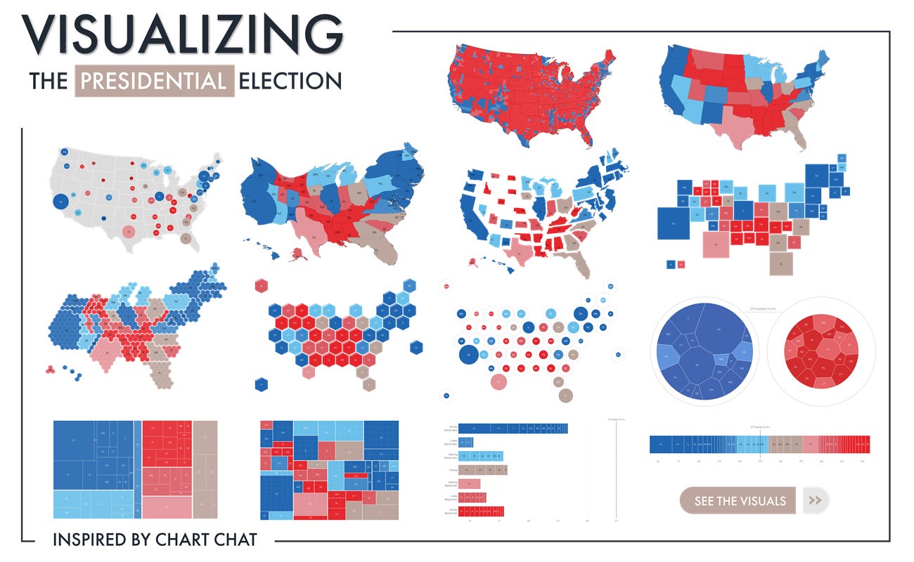
There are lots of alternatives to showing election results as maps, including different kinds of cartograms that scale geographic areas based on other values, treemaps, bar charts, and more. In 2020, Ken Flerlage published an amazing Tableau dashboard with 14 different ways—including 9 maps—to present the presidential election results.
I think I have one more option to add to the mix.
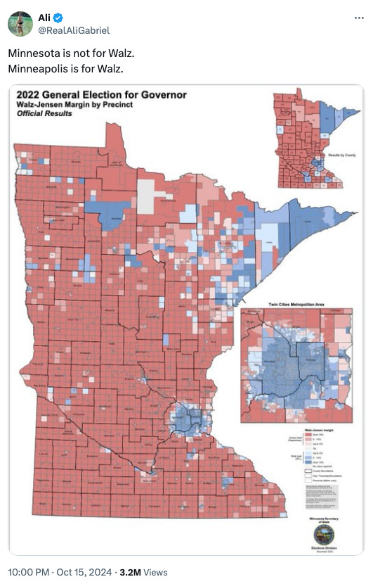
The map below recently showed up in my Twitter feed. The author states, “Minnesota is not for Walz. Minneapolis is for Walz.” The implicit argument is that because the state has more red areas (in this case election districts), that the entire state doesn’t support the Democrat (and now VP candidate) Tim Walz. But, as you might guess, the Minneapolis area is a home to a lot of people: Hennepin County, which is home to most of the city, accounts for 22% of all votes in that election and the broader seven-county area accounts for 56% of all votes. Thus again, land doesn’t vote, people vote.
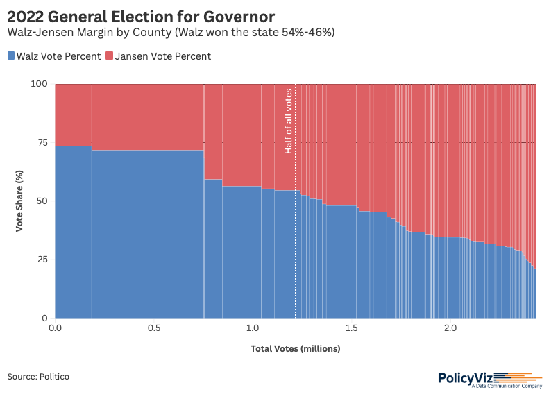
So, with the voting shares in each area (I’m using county-level data here) and the total number of votes in each area, I’m proposing to add a Marimekko chart to our library of visualization types for election results (everything I’m showing below was built in Flourish).
What you see here is percentages of votes for Tim Walz (D; blue) and Scott Jensen (R; red) along the vertical axis and total number of votes (in millions) along the horizontal axis. I’ve sorted the results by the percentage of votes for Walz, so the tallest blue bar is on the left and the shortest is on the right.

What you can see is that the counties with more votes—especially Hennepin county in the second bar—have a greater share of votes going to Walz. You’ll also note that I inserted a vertical line at the 50% point for all votes, to help make two additional points: First, that the more populous counties make a big difference in the total and second, that it’s not like Walz got zero votes in the smaller counties, just a smaller relative share. (If you want to play with the interactive version, you’ll see that I’ve added a standard choropleth map in the tooltip.)
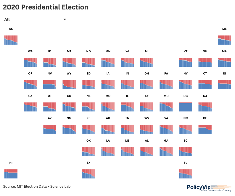
With this in hand, I tried extending the approach to the full country. The folks at Flourish have introduced a new feature that allows users to create a custom tile layout, so I created a separate Marimekko for each state and laid it out as a tile grid map. You can also choose to zoom into any of the states, to see the data in more detail (that functionality is a little janky at the moment and doesn’t work exactly the way I’d like it; hopefully, the Flourish team will fix it soon). As with the Minnesota visualization, clicking on any state opens up a county-level map of the entire country.

I don’t know if this Marimekko approach is objectively better than a standard map or cartogram map; after all, people are more familiar with maps and find them easy to read. But these alternative depictions can help users better understand that just because there are more pixels of a single color on a map doesn’t necessarily mean there are more votes for that person.
Let me know what you think! Reach out on Substack, LinkedIn, Twitter/X, or wherever you like to connect!
Thanks,
Jon
Podcast: Flowers & Numbers: Natalia Kisileva’s Journey of Creativity and Community
In this week’s episode, I interview Natalia Kisileva about her transition from engineering to data visualization and her work in data art and physicalization. We discuss her great Substack newsletter “Flowers and Numbers” and how she shifted her focus to data art, fostering community-building efforts, after the pandemic. Our conversation explores the relationship between physical and digital data art, and Natalia advocates for creative visualizations to engage audiences emotionally and enhance communication. Learn more about Natalia’s work and how you can bring data art and data physicalization into your own work!
Question for you: Lots of podcasts are moving to the paid subscription model. At the moment, I don’t plan on putting the PolicyViz Podcast behind a paywall, but pulling in just a bit of revenue would help cover production costs, like audio and video editing, social media assets, and more. Please let me know if you would be willing to pay for access to the podcast.
Things I’m Reading
Book & Articles
Supercommunicators: How to Unlock the Secret Language of Connection, Charles Duhigg
Indigenous Statistics, by Maggie Walter and Chris Anderson
A Qualitative Analysis of Common Practices in Annotations: A
Taxonomy and Design Space, Rahman et al.
(Almost) All Data is Absent Data, Ross et al.
Misinformed by Visualization: What Do We Learn From Misinformative Visualizations?, Lo et al.
Exploranation: A New Science Communication Paradigm, Ynnerman et al.
Post-growth Human–Computer Interaction, Sharma et al.
Note: As an Amazon Associate I earn from qualifying purchases.
Supported by: WooCommerce Marketplace
Unlock the full potential of your online business with our cutting-edge WooCommerce plugins. From advanced payment gateways to powerful marketing tools, streamline operations, increase conversions, and enhance the customer experience. Easy to install, fully customizable, and backed by 24/7 support.


