Hi all,
Creating data visualizations can be a lonely business. You sit behind your desk working with code, design tools, or other programs to pull together a visualization you hope will elicit insight and help people make discoveries. But working at the computer all the time can also make us forget that people live in a physical world and that we can use that physical world to engage them in different and exciting ways.
Through data physicalization, we can map data to a physical form and facilitate tactile interaction, manipulation, and immersion. Think of the exhibits you’ve seen at a science museum or children’s museum, where there are different ways to interact by drawing, placing stickers on walls, touching screens, or flipping a panel. In the field of data visualization, we’ve seen a variety of data physicalization projects. In the Dear Data project, Giorgia Lupi and Stefanie Posavec mailed each other hand-drawn postcards from personally collected data over an entire year. The very cool Making with Data: Physical Design and Craft in a Data-Driven World by Samuel Huron, Till Nagel, Lora Oehlberg, and Wesley Willett (also check out my podcast interview with these folks) shows a variety of different physical data projects from a range of designers and artists.
I’ve always been intrigued by these physical expressions of data and wanted to bring a smaller-scale approach to work. About three months ago, I embarked on a project to engage my Urban Institute colleagues in a series of physical data visualization projects. With numerous conference rooms and common spaces less busy than they were before the pandemic—about a third of Urban staff are in the building on any given day—I discovered numerous open areas I could use to ask people to provide their own data and to explore the physical world of data.
Each week, I create a new Data Physicalization at Urban (what I call “DPAU”) project where I ask colleagues to answer a question using physical representations of their data. I set up the project in the morning, take pictures, and share the task and location (I try to move it to different areas each week) on two of our internal Slack channels. The project stays up for a week before it’s replaced with a new visualization. I post the results—sometimes with an actual digital recreation of the visualization using the collected data—to those same Slack channels.
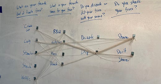
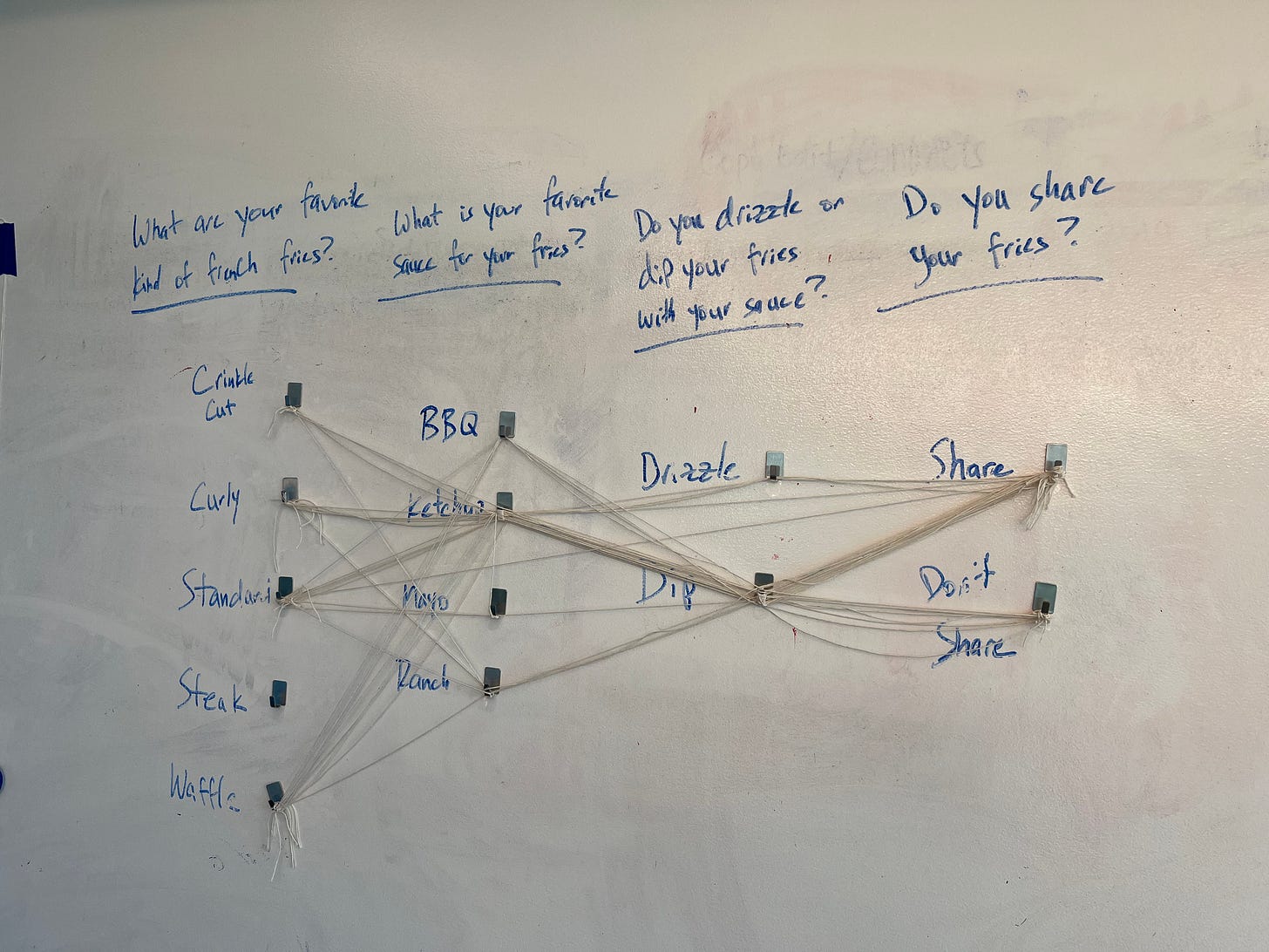
For example, in the project’s first week, I created a Sankey diagram of french fry consumption. I attached hooks to a wall in four columns: favorite french fry (crinkle cut, curly, standard, steak, waffle), favorite sauce (BBQ, ketchup, mayo, ranch), whether you drizzle or dip your fries (dip, drizzle), and whether you share your fries (yes, no). Participants tied twine to connect each hook across the wall.
You can learn more about the entire project and details for each week at the Data at Urban blog post. I’m also keeping an updated list of projects at PolicyViz, where you can get more information about each and access my Amazon list of tools and materials you might need to create your own project.
➡️ Read the Data at Urban post
Thanks,
Jon
Podcast: Tracking Data Visualizations in Congress with Bill Gray
William Gray is the guy behind Floor Charts, the website and Twitter feed that documents all things graphic in the US Congress. During the day, Bill oversees the strategic communications efforts at R Street and manages its growing Communications team, including overseeing the public relations, digital and events units. He joined the organization in 2020. Previously, William was communications director at Issue One, the leading cross partisan political reform group in Washington, where he helped launch and executive produce the first conservative political reform podcast, Swamp Stories. Prior to Issue One, he managed press and negotiated news partnerships as the media relations specialist for the Center for Public Integrity, one of the oldest nonprofit investigative newsrooms in the country; and was a producer at C-SPAN, delivering daily public affairs programming and coverage of Congress and the White House to viewers around the world.
Two Free Equity Webinars
I’m participating in two webinars on equity and data visualization in the coming weeks. Please consider attending.
“An Equitable View towards Data Communications” with Shelli Golson-Mickens and Elizabeth Grim on Friday, Dec. 8, at 12 p.m. EDT.
“Data Equity for All: Using and Visualizing Data Responsibly” with LA Tech4Good on Thursday, December 14 at 1 p.m. EDT / 10 a.m. PDT.
Substack Referrals are on!
I have enabled Substack referrals to help expand the reach of this newsletter. Here’s how you can participate:
1. Share The PolicyViz Newsletter. When you use the referral link below, or the “Share” button on any post, you'll get credit for any new subscribers. Simply send the link in a text, email, or share it on social media with friends.
2. Earn benefits. When more friends use your referral link to subscribe, you’ll receive special benefits.
Get a Thank you on X & Instagram for 10 referrals
Get a signed copy of one of my books for 150 referrals
Get a 30 minute Zoom chat for 300 referrals
To learn more, check out Substack’s FAQ.
Things I’m Reading & Watching
Books
Indigenous Continent by Pekka Hämäläinen
Articles
Erasure and Recognition: The Census, Race and the National Imagination by Naomi Mezey
Designing Effective Welfare Programs: Evidence from SNAP’s BBCE Expansion by Jou Chun Lin
How to Become an Ally to Indigenous Peoples from the Seventh Generation Fund
Data Visualizations
Unpacking the Mystery of Missing Gender Data from the World Bank (matrix)
Overall Life Satisfaction from Marc Reid (matrix)
2023 NFL playoff picture: AFC, NFC seed projections in Week 13 from ESPN (heatmap)
A computer-assisted textual analysis of 10,191 rape news headlines shared on social media by Md. Sayeed Al-Zaman (Word Cloud in Bangla)
Job Openings
Senior data journalist / developer, The Times and The Sunday Times (UK)
TV, Movies, Music, and Miscellaneous
Welcome to Wrexham, Hulu
Lessons in Chemistry, Apple TV
The Crown, Netflix
Note: As an Amazon Associate I earn from qualifying purchases.
Sponsor: Nom Nom
Nom Nom delivers fresh food made with whole ingredients, backed by veterinary science. And science tells us that dog health starts in the bowl so improving their diet is one of the best ways to help them live a long, happy life. All you have to do is order, pour and serve.
Try Nom Nom today, go to Nom Nom and get 50% off your first order plus free shipping with the code policyviz.


