Can We Improve on the Stacked Bar Chart?
The stacked bar chart is a tricky little devil. It stacks several segments on top of each other, asking the reader to make part-to-whole comparisons while comparing total amounts. So when we create stacked bar charts, we ask a lot of our readers: make several comparisons simultaneously, with many of those comparisons sitting across different baselines.
A recent debate on LinkedIn explored some alternatives to the standard stacked bar chart. But maintaining all the stacked bar charts’ functionality while making it simpler to read proved easier said than done. Consider that in a classic stacked bar chart, we want readers to see the varying totals in the chart and compare the sizes of each of the segments.
While we could simply break the chart up into small multiple bar charts instead, this solution still compromises on functionality because breaking the chart up makes comparing the total values across groups harder. One remedy to that situation—shown below—is to include the chart and an additional chart showing the total.
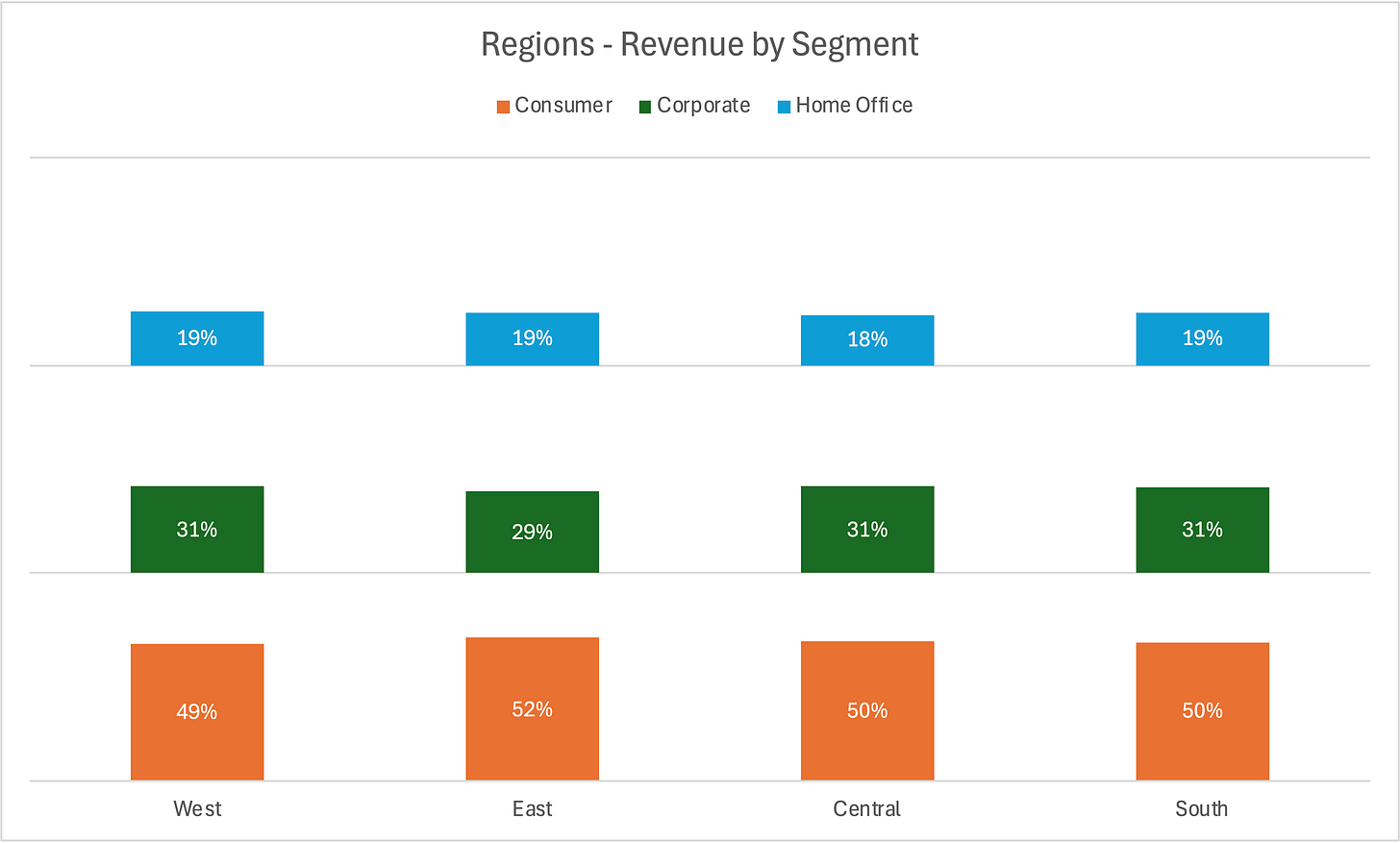
Another variation on this approach is when the data are percentages and all groups sum to 100 percent. In this case, we don’t need to show the set of total bars because the length of the bars are all the same.
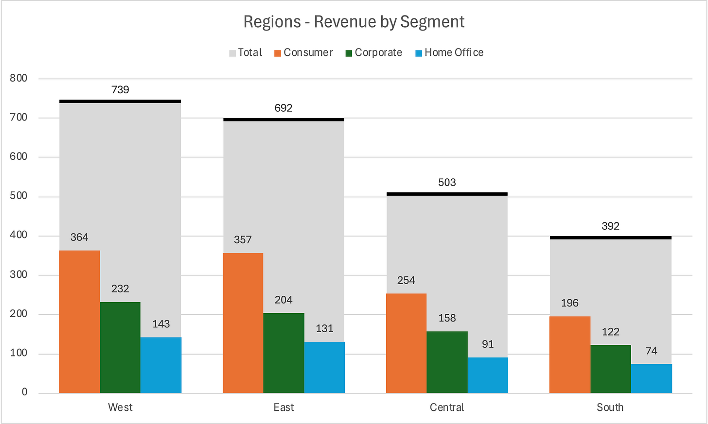
But what if there’s a better way to preserve all of a stacked bar chart’s functionality? Kevin Flerlage initially kicked off the conversation with this blog post (with Sebastine Amede and Darragh Murray) suggested a paired bar chart of the segments and add a separate bar representing the totals spanning the pairs—kind of behind them in a way.
I don’t think I immediately object to this approach. On the one hand, it does enable the reader to compare the segments more accurately and clearly. But on the other, I wonder if readers will view the gray total bar as the actual total? Maybe they’ll view it as some other amount? Also, having the total bar extend further horizontally than the individual segments felt like it was a separate series rather than directly connected to the existing bars.
In this recreation, I trimmed the total bar to sit just behind (or on top, however you want to say it) of the segments.
I was intrigued by the approach, however, and tried a few of my own versions.
I added a thick line to the top of the total bar to accentuate the value, but it still feels unclear.
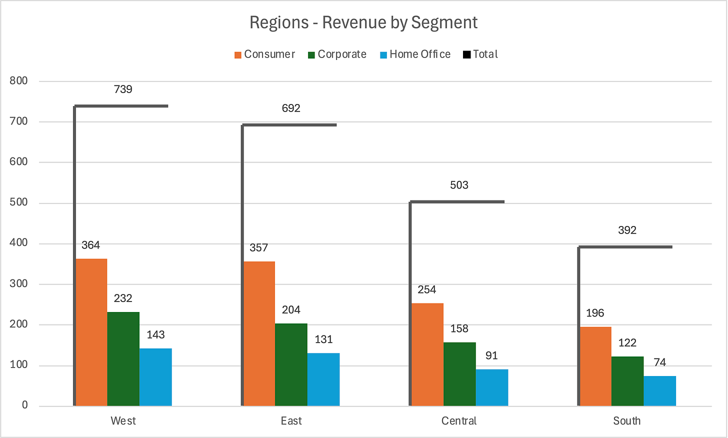
I also got rid of the total bar completely, leaving just the horizontal line. I thought I would like this more, but there’s now a disconnect between the segments and the line that represents the total.
A few others on LinkedIn suggested this version—dubbed the “umbrella chart”—as an in-between version. Here, we have the horizontal line representing the total, but the vertical line connects the total to the segments.
In the end, I’m not sure if any of these really work. For all its flaws, people know how to read the stacked bar chart and can focus on the total or segment in which they are most interested in exploring. These other approaches seem to disconnect the total from the part-to-whole comparison too much, and I worry that they will ultimately confuse people.
What do you think? Do you like one of these alternatives?
Podcast: Edward Tufte: Designing with Data, Art, and Purpose
In this week’s episode of the PolicyViz Podcast—the second-to-last episode of the sseason—I am reposting my 2015 interview with Edward Tufte (now with better audio quality), one of the pioneers of data visualization and author of seminal books like The Visual Display of Quantitative Information. Our conversation spans from Tufte’s early teaching days to his vision for the future of data communication, offering a rich mix of philosophy, design, and practical insight.
I’m teaching a “Powerful Presentations” workshop with Columbia University on July 28 and 29. Come join me to learn how to create and deliver effective, memorable presentations. Scholarships & early bird rates available:
Things I’m Watching
Accountant 2, Amazon Prime
Watched this the other night with the whole family. We all liked it, but the big thing missing is why they focused on this particular family. We never really understood that. (Mom, if you’re reading this, this movie is pretty violent, so I don’t think you’d like it.)
Young Sheldon, Netflix
Okay, yeah, I kind of love this now. And Wallace Shawn should be in every episode. I keep waiting for him to say “inconceivable,” not only because it’s the obvious thing he should say, but also because this show and Big Bang Theory are so good at those kind of references
Murderbot, AppleTV
This is a pretty fun show.
Slow Horses, AppleTV
OBSESSED!! I’ve been missing out on this show for way too long! Holy hell, this is a great show. (Mom, if you’re reading this, you’ll love this show!)


As a professional data vizzer , I can honestly say I’ve never seen a stacked bar chart and gone oh I can I have a conversation with it. I’m always stuck teasing out if this category grew or if it’s bc the category under it is larger than before. Whatever secrets it holds it holds it well. I welcome anything else.
I like your "trimmed grey bar" showing the total for each category but two comments:
- I would put the numbers of the individual INSIDE each segment (probably with a white font) to reduce confusion as to which bar the number should be associated with.
- Since the width is not a variable, I would choose a much narrower width as long as the number fits in it. That way, the overall grey bar will be much thinner.
In the end, it goes back to what you want to visualise. The relative dimensions or the absolute dimensions. There will always be one that is more important than the other.