
Classic Data Visualization Books for Your Library

A few weeks ago, I gave you my list of the three data visualization books about maps that I recommend you have in your dataviz library. Today, I turn to historical books for your collection.
Before any of those modern books, before Tableau, before D3, before dashboards, there were a handful of books that defined how we think about visualizing data in the first place. These are not books you buy for quick tips or software tutorials. These are the books that shaped the field. They explain why we make charts the way we do. They are the intellectual foundation of modern data visualization.
Obviously, there are hundreds, if not thousands, of books on data visualization over the years beyond just those I’m listing here. But for the modern data visualization specialist, I believe these are the ones that are still worth having.
If you’re building a serious data visualization library, these are the historical books you start with:
The Visual Display of Quantitative Information (1983) from Edward Tufte.
This is the book that pulled data graphics out of the back room of statistics and into the center of design and communication. Tufte argued that charts are not decoration; they are analytical tools. Concepts like data–ink ratio, chartjunk, and small multiples became part of the dataviz vocabulary because of this book. Though Tufte’s is maybe the most rigid, dogmatic voice in the data visualization field—and many of his guidelines are based on nothing more than his personal preferences—this book is still very useful, full of great examples, and, yes, lovely to hold.
Semiology of Graphics (1967, English edition 1983) from Jacques Bertin.
If Tufte helped us see graphics differently, Bertin explained how graphics work. This book is dense, technical, and deeply systematic. Bertin introduced the idea of visual variables—position, size, color, orientation, texture, and shape—and showed how they could be combined to encode information. It’s not an easy read, but once you understand it, you start to see the logic behind all graphical design.
Exploratory Data Analysis (1977) from John Tukey.
Tukey wasn’t trying to write a data visualization book—he was trying to change how people analyze data. But in doing so, he gave us boxplots, stem-and-leaf plots, and a mindset that values looking at data before modeling it. The core idea—that graphics are tools for discovery, not just presentation—runs through modern data visualization. This book reminds us that charts are not just for audiences; they’re for analysts.
The Elements of Graphing Data (1985) from William Cleveland.
Cleveland brought experimental rigor to graphical perception. Where Tufte and Bertin argued from philosophy and theory, Cleveland tested how people actually read charts. His work on position versus angle versus area, on scales, on smoothing, and on graphical integrity is the empirical backbone of many best practices we now take for granted. This book quietly explains why some charts are easier to read than others—and proves it.
Show Me the Numbers (2004) from Stephen Few.
Few is the bridge between the foundational thinkers and modern practice. This is the book that translated Tufte, Bertin, Cleveland, and Tukey into guidance for people working in business, dashboards, and real-world reporting environments. Few is incredibly dogmatic, but unlike his book on dashboards, which, mostly because the tools and technology have changed, hasn’t aged all that well, Show Me the Numbers is still great. It’s practical without being simplistic, and conceptual without being academic. For many practitioners, this was the first book that made historical theory feel immediately usable.
I’d be remiss if I didn’t note that these books are not light reading. Some are dense, some are philosophical, and some feel dated in examples. That’s okay. Their value isn’t in the screenshots—it’s in the thinking.
Once you read these, you start noticing their fingerprints everywhere: in software defaults, in design advice, in training programs, and in the way we talk about charts.
If you want to get deeper into data and data visualization history, I suggest you check out the work from RJ Andrews, Jason Forrest, the David Rumsey collection, and Michael Friendly, to name a few. A few other books in this genre that are certainly worth your time:
W.E.B. Du Bois’s Data Portraits: Visualizing Black America from Whitney Battle-Baptiste and Britt Rusert
A History of Data Visualization and Graphic Communication from Michael Friendly and Howard Wainer
The Book of Trees: Visualizing Branches of Knowledge by Manuel Lima
The Minard System: The Complete Statistical Graphics of Charles-Joseph Minard by Sandra Rendgen
History of Information Graphics by Sandra Rendgen and Julius Widermann
Also, many of these authors have been on the PolicyViz Podcast, so be sure to take a listen!
They’re not just books about charts. They’re books about how humans see, think, and reason with information.
That’s why they still belong on every data visualization bookshelf.

300th PolicyViz Podcast
The 300th episode of the PolicyViz Podcast comes your way this week!! In it, I’m joined by Cole Nussbaumer Knaflic and Mike Cisneros from Storytelling with Data to talk about their new book, Before & After. We dig into where the examples came from, how they selected and refined real client work, and why the book focuses so heavily on process rather than rules or templates. We also reflect on how the data visualization field has evolved over the past decade—from best practices and chart types to iteration, audience empathy, and real-world constraints. Along the way, we talk about teaching data viz, common pitfalls, and why there’s no such thing as a true “201 course”—only practice.

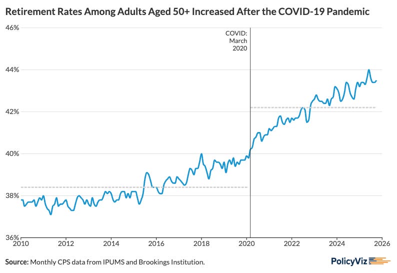
Fun Graphs
The share of people 50 years old and over who are retired shot up after the pandemic. There’s some interesting sample weighting issues at play in the estimation here; if you’re really interested, check out this report from the Brookings Institution.
Books, Articles, and Podcasts
Power to the Public: The Promise of Public Interest Technology by Tara Dawson McGuinness and Hana Schank
Visualization Vibes: The Socio-Indexical Function of Visualization Design by Morgenstern et al.
America’s Statistical System Is Breaking Down in Bloomberg
TV, Movies, and Music
Code 3
Rainn Wilson is the perfect fit for this funny, and sometimes sad, movie that is an explicit commentary on the US healthcare system.
Mare of Easttown
Uhhh, how did I never watch this show!! It was so damn good!!!
Peaky Blinders
Yeah, yeah, I know I’m late, but, whoooo, it’s so good!
The Pitt, HBO
Season 2 is underway

Love this list! I usually recommend yours “Better Data Visualizations” :)
Among the “modern” ones, it’s definitely one of the best and one of the most comprehensive, covering so many nuances.