Hi all,
I’m often asked to teach a “DataViz 201”-type course after my Core Principles of Data Visualization workshop. I’ve thought about how I might do such a workshop or class, but I’ve always thought a 201 class would just be….making things. I feel like there is only so much instruction one can give (that is not in a tool or coding language) and the art of data visualization is just trying, creating, reflecting, and trying again.
My perspective on this hasn’t really changed, but I think my view is crystallizing into how a group or organization might help themselves move to the 201 level. Overall, I think it comes down to three parts:
Lecture. This is the introductory-type course. It’s not just someone lecturing for 4-, 6-, 8-, or 100-hours, or something like that, but it’s your basic instruction. It’s not that there are rules to data visualization, but getting a better understanding of how humans perceive visual content, different graph types, and some basic strategies and best practices is, I think, very useful to get started.
Tools. At some point, someone is going to have to create something and 99.99% of the time, it’s going to be built on a computer. Data visualization tools can be click or drag-and-drop based on the desktop (e.g., Excel, Google Sheets) or in the browser (e.g., Flourish, Datawrapper) all the way to programming languages (e.g., R, D3). I’m not one to say there is an absolute “right” tool, but whatever it is, to move an individual’s or organization’s data visualization to the next level, some kind of learning is going to be necessary.
Regular Feedback and Community. Maybe this is the hardest one to get off the ground. You need a community to help you on your journey, either as an individual or as part of a larger organization. It might be a group with a regular cadence (e.g., weekly or monthly) or maybe it’s just a Slack channel or Sharepoint site where people can submit their work for feedback and advice. I’ve seen people working alone in organizations, trying to help their colleagues improve their data visualizations, and it can get disheartening and dispiriting. Having like-minded people to work with (and sometimes commiserate with) on the path towards better data communication can pay huge dividends. I’ve been thinking of different ways organizations can facilitate this kind of community and will try to share some ideas soon.
That’s all I have for this week. If you’re in the US, I hope you have a great Thanksgiving holiday. And if you’re not in the US, well, I hope you have a great week!
Thanks,
Jon
I need your help!
My latest book Data Visualization in Excel continues to sell well—according to my publisher, at least. But at the moment, it only has 9 reviews on Amazon. If you’ve read and used the book, I would really appreciate you taking just a moment to add your rating and/or review to Amazon. You don’t need to write a lot: “Great book!”, “Great tutorials!”, “Love learning how to make better data visualizations in Excel!”, “This is the best book I’ve ever read. Seriously, fiction or nonfiction, this is the best!”
Okay, that last one may be a bit of overkill, but you get the idea. It’ll just take you a moment. Click the button below and add your ⭐️⭐️⭐️⭐️⭐️ rating to the Amazon page. Thanks!!
Podcast: Be a Better Presenter with Andrea Pacini
Andrea Pacini is the author of the best-selling book Confident Presenter, a presentation coach and Head of Ideas on Stage UK. He specializes in working with business owners, leaders and their teams who want to become more confident presenters. Since 2010 Ideas on Stage has worked with thousands of clients around the world, including organizations like Microsoft, Spotify, eBay, The World Bank and over 500 TEDx speakers. Andrea is on a mission to stop great ideas from failing just because of the way they are presented. His vision is to help hundreds of thousands of business leaders inspire their audiences, increase their influence, and make a positive impact in the world.
Last Chance to Get Discounted Price on Asynchronous DataViz Course!
My asynchronous dataviz course at Skillwave is about to get a big upgrade. We are going to be posting full Excel, Excel’s Data Model, and PowerBI tutorials to dozens of graphs. If you want to get access to the course for the current, lower price, now is your chance! Skillwave will be announcing a big Black Friday sale next week!
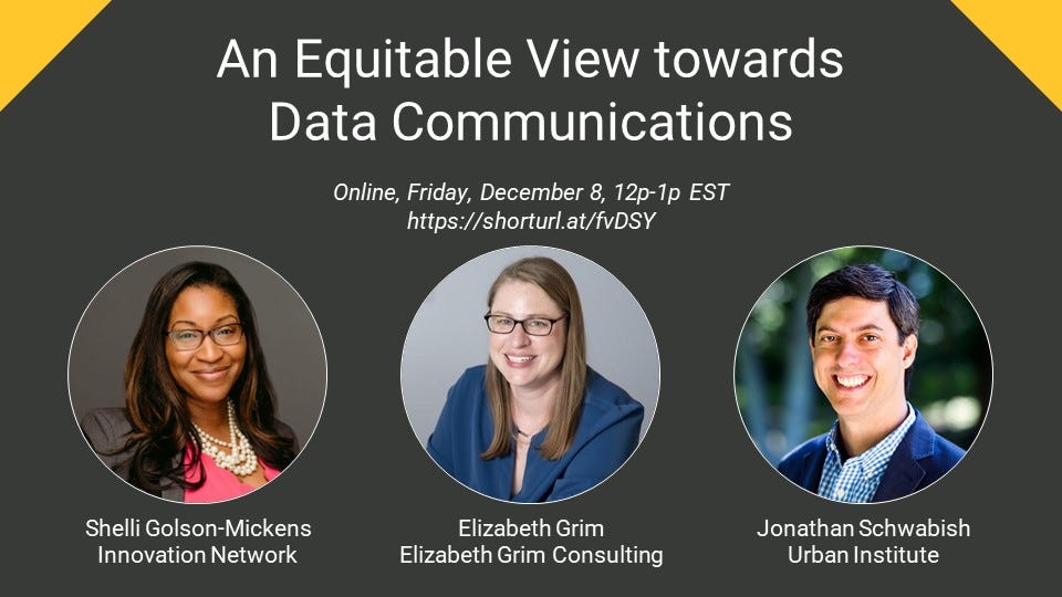
An Equitable View towards Data Communications Webinar
How far does equity continue beyond your evaluation report? Does your reporting truly communicate what you intended? Join me and my colleagues, Shelli Golson-Mickens and Elizabeth Grimm, as we help you answer these questions with our free webinar, “An Equitable View towards Data Communications,” on Friday, Dec. 8, at 12 p.m. EDT.
Together, we’ll discuss:
➡️ Developing a framing and lens for communication that centers your audience and self-reflection
➡️ Adopting inclusive and non-violent language
➡️ Creating visuals with an equitable and inclusive approach
Things I’m Reading & Watching
Books
Indigenous Continent by Pekka Hämäläinen
Articles
Erasure and Recognition: The Census, Race and the National
Imagination by Naomi Mezey
Beyond Bar and Line Graphs: Time for a New Data Presentation Paradigm by Weissgerber et al.
What Students Learn with Personal Data Physicalization by Charles Perin
Data Visualizations
Gaza reports more than 11,100 killed. That’s one out of every 200 people. from the Washington Post
An American Puzzle: Fitting Race in a Box from the New York Times
The collapse of insects from Reuters
TV, Movies, Music, and Miscellaneous
Only Murders in the Building, Hulu
The Morning Show, Apple TV
Welcome to Wrexham, Hulu
Lessons in Chemistry, Apple TV
Shorsey, Hulu
Note: As an Amazon Associate I earn from qualifying purchases.
Sponsor: Nom Nom
Nom Nom delivers fresh food made with whole ingredients, backed by veterinary science. And science tells us that dog health starts in the bowl so improving their diet is one of the best ways to help them live a long, happy life. All you have to do is order, pour and serve.
Try Nom Nom today, go to Nom Nom and get 50% off your first order plus free shipping with the code policyviz.


