Exploring Formula 1 Through Data: Insights Inspired by My Son
PolicyViz Newsletter #51
Some of my data interests are spurred by my work at the Urban Institute, others by things I’m personally interested in, like sports or politics. But sometimes, my kids inspire my work. My son inspired my exploration of timing of goals in NHL when he kept scoring in the last minute of periods when we played hockey on the Xbox. Today, he has inspired me again.
A couple of years ago, my son got really into Formula 1 (F1) racing. And when I say “got into” I really mean it—do you know a lot of 14-year-olds who will wake up at 6 a.m. on a Sunday morning to watch a race in Bahrain or Qatar? Yeah, that’s him.
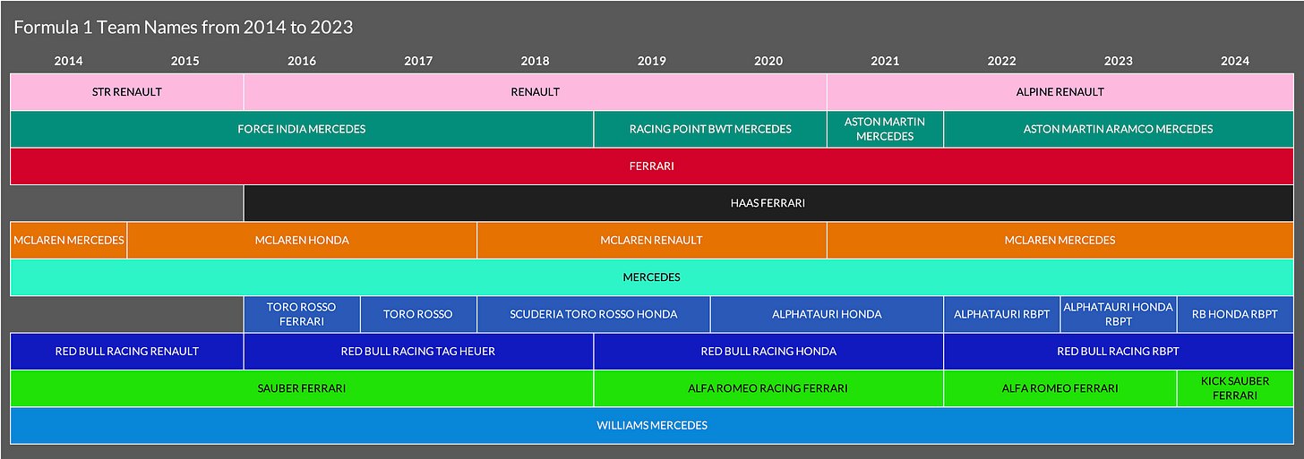
In my efforts to better understand his interest, I’ve been watching F1 races, F1 Instagram, and the Netflix special Drive to Survive. In F1, 10 teams, each with two drivers, compete over the season, which seems easy enough to keep straight, right? Wrong! Drivers switch teams all the time and even the team names have changed dramatically over just the past few years. Pierre Gasly, for example, was with the RB Honda team when Drive to Survive started in 2018 but now races for Alpine Renault. But the names of those teams have changed as well! In 2018, RB Honda was called Scuderia Toro Rosso Honda, and Alpine Renault was just called Renault.
To better understand all of these changes, I pulled team (“constructor”) and driver data from the Formula 1 website for each year back to 2014. (I thought a decade would be a nice round number.) I did this manually, but fortunately the data are well organized and it didn’t take me too long. I did try using the f1dataR package, but it kept timing out. Not sure what’s going on there. Once I had the data, I did a bunch of manual coding work to align team names and used some Stata code to help clean and align the various files.
Then, I created three graphs in Excel (and an interactive version in Flourish!):
First, I looked at changes in team names over the past decade. In this Gantt chart, arranged alphabetically, you can clearly that while most teams have changed names at least once, three haven’t changed at all: Ferrari, Mercedes, and Williams Mercedes. (Haas Ferrari also hasn’t had a name change, but the team started in 2016.)
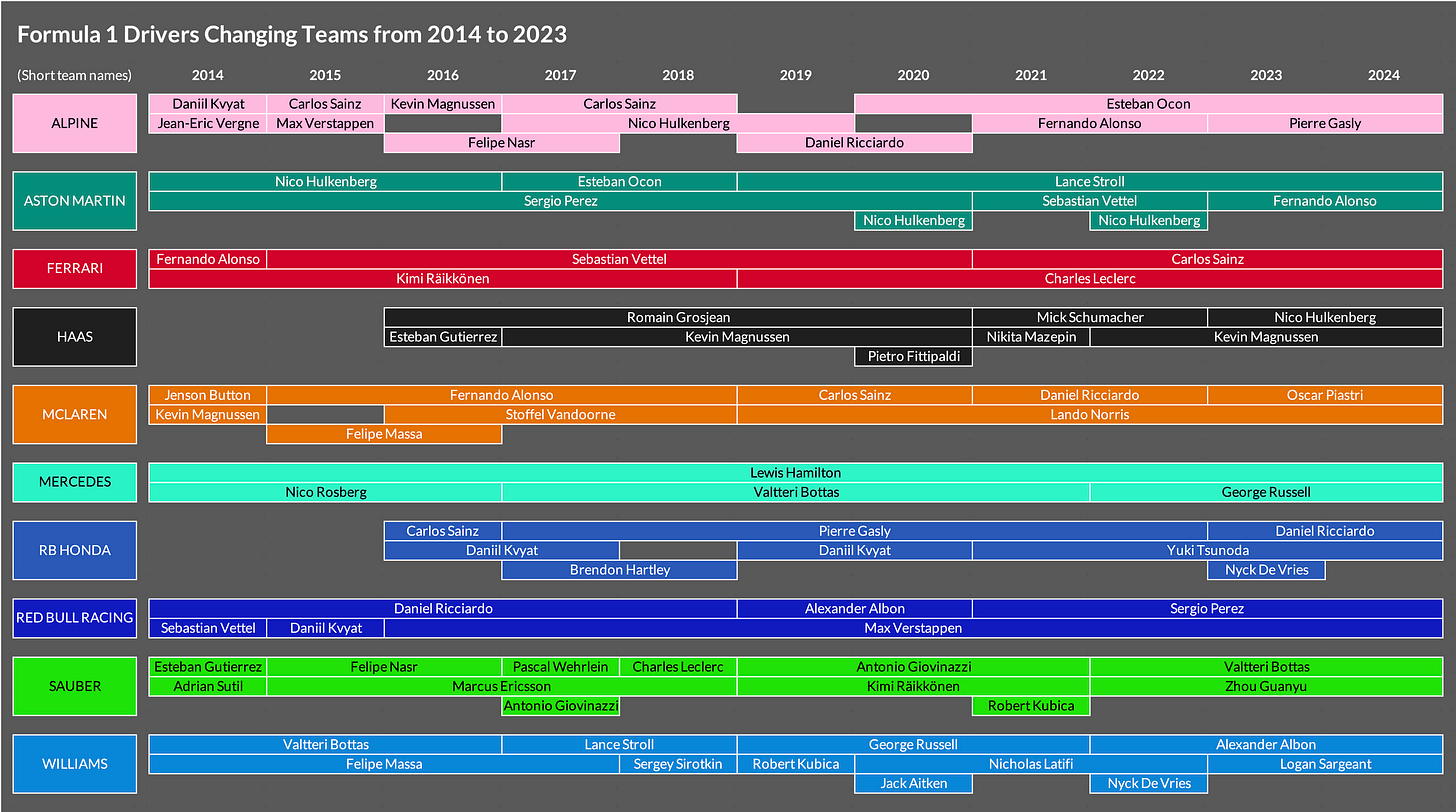
Second, I looked at changes in drivers for each team. Using a Gantt chart approach again, I arranged the teams alphabetically and placed the drivers along the rows. The visual is pretty fun to explore. You can see Carlos Sainz entering the league in 2015 with Alpine, then moving to RB Honda in 2016, then back to Alpine in 2017 and 2018, to McLaren in 2019 and 2020, and then to Ferrari where he currently drives. I thought about creating some kind of arrows and a map to make it easier to track each driver, but I liked having the drivers aligned by team.
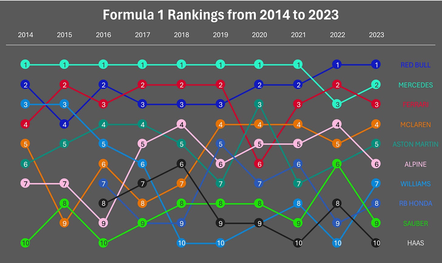
Finally, I wanted to see how each team’s points changed over the past decade. Of course, my son knows all of these details, so this exercise was really more for my knowledge and to be able to talk with him. Here, you can see Mercedes’ dominance across most of the decade until the past couple of years. You can see Ferrari’s awful 2020 season, McLaren making strides from the bottom part of the field to fourth and fifth place since 2019, and Williams’ fall from grace from third place in 2014 and 2015 to the bottom of the field over the past few years.
I’m sure there’s more to poke around in here and I even created some interactive versions in Flourish. Regardless, now I feel a bit more comfortable in my F1 knowledge going into the new season. Plus, my son and I are heading up to Montreal in June to see the Grand Prix!
Podcast: Tracing the Narrative: The Art of Autographic Design in Data Analysis with Dietmar Offenhuber
In this week’s episode, I chat with Dietmar Offenhuber about his new book, Autographic Design and the concept of autographic data analysis. Dietmar stresses the significance of recognizing the material origins of data and the influence of extraneous variables. He advocates for a qualitative approach that pays attention to data traces, which can uncover deeper narratives. In our conversation, we explore what is meant by autographic design and urge a wider lens on data to grasp multifaceted problems thoroughly. Additionally, Dietmar’s work underscores the interplay between qualitative and quantitative methods, emphasizing the role of subtlety and conjecture in data interpretation to bring a more nuanced understanding of the stories behind the numbers.
Things I’m Reading & Watching
Books
Chart Spark from Alli Torban
Nightcrawling by Leila Mottley
Undoing Gender by Judith Butler
Articles
An Opportunity for the Census Bureau to More Accurately Estimate the Disabled Population in the US, Urban Institute
Input Visualization: Collecting and Modifying Data with Visual
Representations, by Bressa et al. (CHI)
How AI reduces the world to stereotypes, Rest of World
OpenAI’s GPT is a Recruiter’s Dream Tool. Tests Show There’s Racial Bias, Bloomberg
TV, Movies, Music, and Miscellaneous
Drive to Survive, Netflix
The Regime, HBO Max
The Creator, Hulu
Dream Scenario, HBO Max
Note: As an Amazon Associate I earn from qualifying purchases.
Sponsor: Maryland Institute College of Art
The Maryland Institute College of Art (MICA) application deadlines for summer and fall are April 22 and August 1. Spots are limited, so start your application now and talk to an enrollment coach by filling out our form at online.mica.edu/dav/.


Never realized Williams was that good until I saw this chart