Exploring Tile Grid Maps: From Hooked Beginnings to Unconventional Layouts
PolicyViz Newsletter #53
I don’t remember where I saw my first tile grid map of the United States. But wherever it was, I was immediately hooked and started making them for my Urban Institute colleagues the next day (you can download an Excel template version from the Urban style guide, if you like).
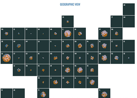
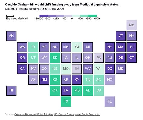
The advantage of tile grid maps (TGM) is that they equalize the geographic units (in the above case, US states), which means we can more easily see the small states (e.g., Rhode Island) next to the large states (e.g., California). But they also require some kind of arbitrary decision about where to place the states. For example, in the above version, it’s definitely not true that South Carolina (SC) is east of North Carolina (NC) (otherwise, they would have different names) and it is definitely true that Arizona (AZ) and California (CA) are adjacent to one another. It also seems true that the overall shape of the country is fairly similar in the TGM relative to the true geography—there is an even west coast, Texas (TX) and Florida (FL) stick out along the southern border, and Maine (ME) is up to the top-right.
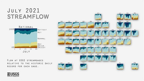
It’s not like the way the Urban TGM is laid out is the objectively right way to lay it out, but it does feel like it mimics the true geography of the country fairly closely. Other variations exist, but all seem pretty close in shape to the US geography.


In 2019, Jane Pong produced this amazing animated GIF of different TGM layouts that has stuck with me for 5 years now. It’s an amazing demonstration of the different layouts some major media organizations were using at the time (and would be fun to update today).

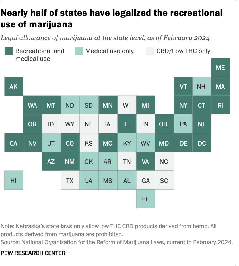
All of this is to say that I found it interesting when I came across this TGM from the Pew Research Center last week. Now, I generally really like Pew’s dataviz (and found myself bookmarking several visualizations on their site while looking at the map; e.g., here and here) but this TGM doesn’t look anything like the US! California (CA) is sticking out to the west and isn’t close to Arizona (AZ). And while North and South Carolina (NC and SC) are in the proper alignment, North and South Dakota (ND and SD) are not! I don’t know why they decided to use this layout but it certainly threw me off.

Now, I’ve seen a few papers about ways to generate tile grid maps (e.g., McNeill and Hal, 2017) but haven’t seen anything testing people’s preferred TGM layouts—that would be interesting interesting. Test whether people who have seen TGMs before (like me) have different preferences than people who haven’t seen them. I wonder if I’ve just seen too many of them that this layout looks completely odd. Dunno, that’s work for another time.
Enjoy Spring!
-Jon
A note on this newsletter
This newsletter is an opportunity for me to share and highlight the work I and others are doing. For the foreseeable future, I have no plans to make this a paid newsletter or to create a separate “membership-only” version. But, an easy thing you can do to help support this newsletter and the work I do is to rate and review the PolicyViz Podcast and/or any of my books on Amazon, Goodreads, or wherever you get your books. If you send me a note that you posted a rating/review, I’ll send out a big public shout-out here and on LinkedIn. So, if you could, please take a few minutes out of your day to post that ⭐️ ⭐️⭐️⭐️⭐️ review. Thanks!
Podcast: Data Beyond the Screen: Sculpting Community Voices with Rahul Bhargava
In this week’s episode of the PolicyViz Podcast, I interview Rahul Bhargava from Northeastern University on the topic of data physicalization. We discuss the role of community engagement and societal impact in communicating data and including different people and communities. Our conversation touches upon teaching combined majors at Northeastern and expanding data engagement through Rahul’s participatory art methods. We explore the limitations of visual learning and advocate for including diverse voices via data sculptures and embodied experiences.
Things I’m Reading & Watching
Books
Crucial Conversations: Tools for Talking when Stakes are High, by Patterson, Grenny, McMillan, and Switzler
The Girls of Atomic City: The Untold Story of the Women Who Helped Win World War II by Denise Kiernan
Articles
Surveying the Landscape of Disability Data and Statistics from the Interagency Committee on Disability Research
The History and evolution of the Term Latinx by Cristobal Salinas Jr. and Adele Lozano
Data Visualizations
This is a teenager from The Pudding [scrollyteling with icons]
News Media and Political Attitudes in the United Kingdom from Pew Research [overlaid histograms]
If You Didn’t Get Into <Dartmouth>, a Public School Is the Better Investment from Bloomberg [interactive scatterplot]
World coal capacity growth jeopardises peak emissions forecasts from Financial Times [stacked bar/column chart]
TV, Movies, Music, and Miscellaneous
Shogun, Hulu
Three Body Problem, Netflix
Band of Brothers, Netflix (again)
Big Bang Theory, Max
Note: As an Amazon Associate I earn from qualifying purchases.
Sponsor: Ant Design System for Figma
Design and develop Ant Design projects faster than ever! The powerful UI kit for Figma based on the most popular React UI library - Ant Design. Create and implement well-documented Ant Design apps in no time!
Variables, Auto Layout, Variants, Component Properties
Dedicated Figma Plugin to copy style settings from Figma to code
Hover and click interactions for easy prototyping
Switch between light and dark theme
Developer-friendly components


In Russia we have many states too and Dataviz community always discuss the correction of tiles' location on such maps. I've even draw the comics about it:
https://optim.tildacdn.pub/tild3133-6131-4532-b933-343833326234/-/format/webp/rus_Soo_eng.png
Wow thanks! Nice tile grid maps collection! ☺️