From Static Infographic to Interactive Tool: Building the Social Security Benefit Explorer
Fourteen years ago, I made an infographic.
I was working in the Social Security group at the Congressional Budget Office and creating an explainer infographic—it was the time of tower infographics, after all—seemed like a logical place for me to combine my economics/policy work and my dataviz work.
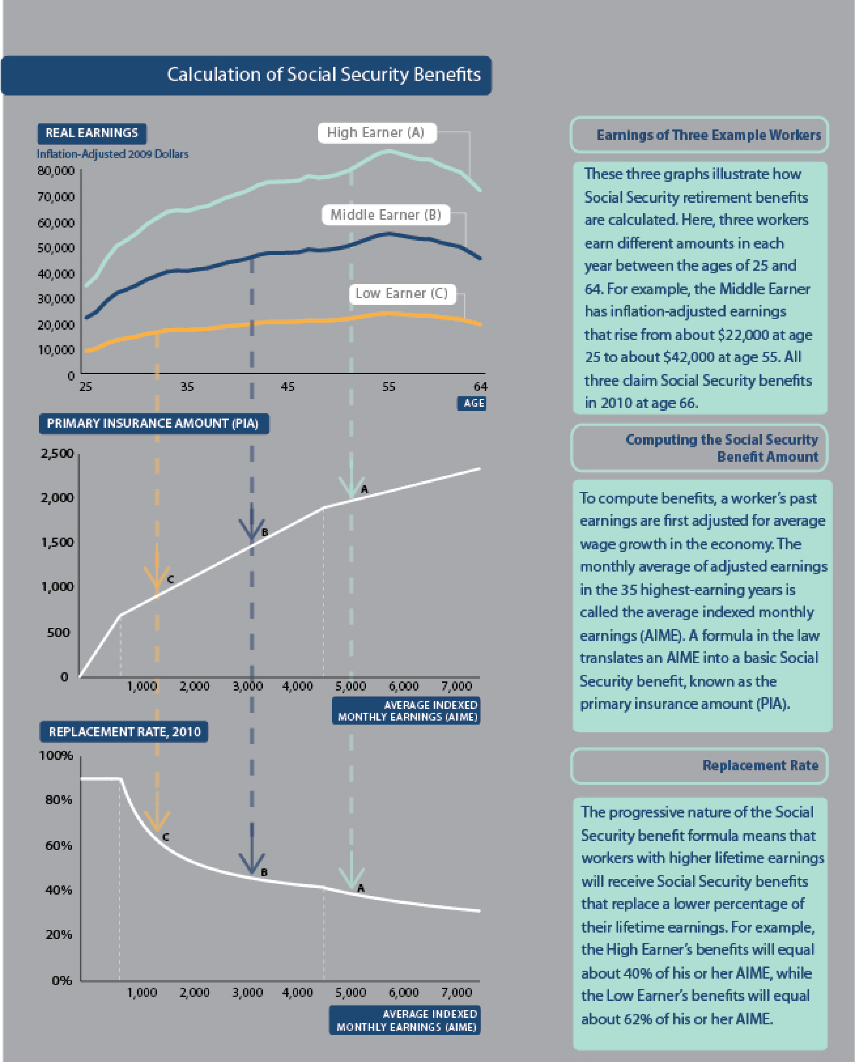
In the core of the graphic, I wanted to explain how Social Security benefits are calculated. They are based on wage-indexed values of your lifetime earnings, pushed through a benefit formula, and indexed over time.
I felt like the graphic explained something genuinely complicated in a way that felt accessible and visually clear.
But it was static. You could look at it but you couldn’t explore it with your own data or adjust any of the levers of the benefit formula.
For years, I’ve wanted to make an interactive version of that graphic. What if a user could enter in their own information and see how their earnings were indexed and converted to monthly Social Security benefits? What if they could manipulate the basic parameters of the benefit formula to see how it would affect their personal benefit and, by extension, the finances of the entire Social Security system?
It seemed like a straightforward project with well-defined parameters and interface.
Last month, I finally built that tool.
The Interactive Version I Always Wanted to Make
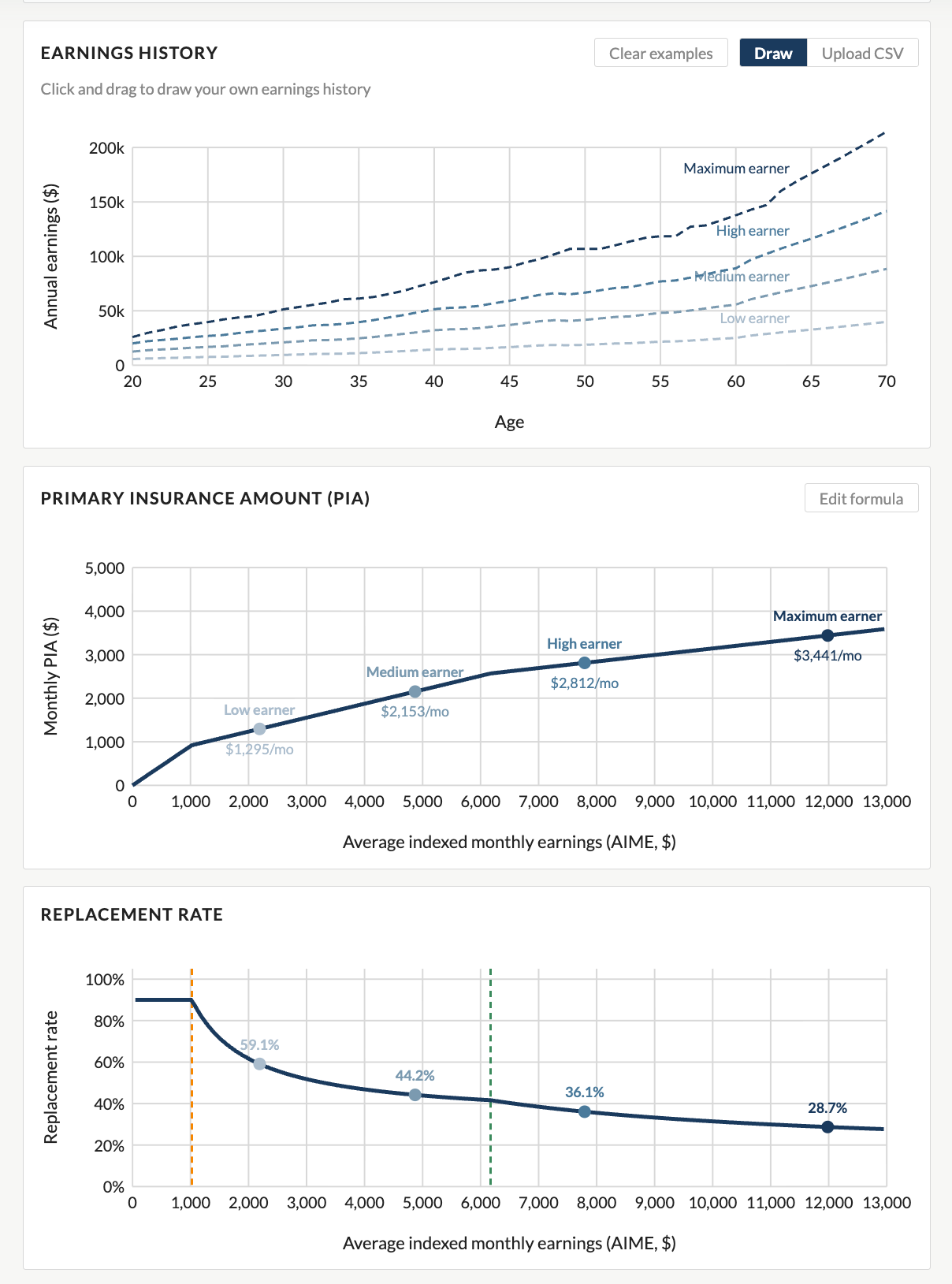
The Social Security Benefit Explorer lets you enter your earnings history, see how benefits are calculated, and to what extent those benefits replace lifetime earnings—the same three-step process I tried to illustrate back in 2011. You can see your indexed lifetime earnings, watch how the benefit formula translates that stream into a monthly benefit, and explore how your replacement rate compares to workers at different income levels.
Building an interactive version was beyond my skillset. Hiring a full-time developer to build a custom interactive tool is expensive; off-the-shelf platforms like Tableau or Flourish are useful for many things, but they don’t really let you build the kind of bespoke, policy-specific calculator I had in mind.
What changed are the new AI tools like Claude. I was able to describe what I wanted—the benefit formula, the user interface, the explanatory text, and even the underlying data series—and iterated toward a working React application without needing to write every line of code myself. It’s not magic, and it still required careful thought about design and communication, but the barrier between “I have an idea for a tool” and “the tool exists” has dropped dramatically. That feels like a genuinely big deal for researchers, educators, and communicators who want to build things but don’t have a development team behind them.
Why This Matters Right Now
Here’s the other reason I wanted to build this tool: Social Security is in the news, and not in a good way.
The program’s retirement trust fund is projected to be exhausted within the next decade. When that happens, absent any legislative action, benefits would be subject to an automatic across-the-board cut of roughly 20 percent.
What happens next is a political and policy question that policymakers will ultimately have to answer. And there are real options for reform: raising the payroll tax rate, lifting or eliminating the taxable maximum cutoff, adjusting the retirement age, modifying the benefit formula, or some combination of all of these (and others).
With all of that being said, helping people understand how the program works will help them better evaluate reform options and express their views to their elected representatives. An informed public is better positioned to evaluate reform proposals, hold elected officials accountable, and, of course, make their personal financial planning decisions.
Start with the Basics
If you want to go deeper on the fundamentals of Social Security, I published a series of videos on my YouTube channel where I talk about all aspects of the history, the finances, and the math of the program. It’s designed for a general audience and covers a lot of ground.
And then come back to PolicyViz and try the Explorer. Upload—or draw—your own earnings histories and see where you land. And if you have comments, questions, or suggestions, please reach out.

Mapping the Invisible: Inside the Atlas of Macroscopes

Welcome back to the show! This week, I sit down with three co-authors of the Atlas of Macroscopes—Katy Borner, Elizabeth Record, and Todd Theriault from the Cyberinfrastructure for Network Science Center at Indiana University—to explore what a macroscope actually is and how it differs from a standard interactive visualization. We trace the 20-year journey of the Places and Spaces: Mapping Science exhibit, from two-dimensional wall maps to the 40 richly interactive pieces featured in this stunning book. Along the way, we talk about design strategies for making complex systems legible to general audiences, the role of AI in data visualization, and what it takes to grab and hold attention on a museum floor.

Fun Graphs
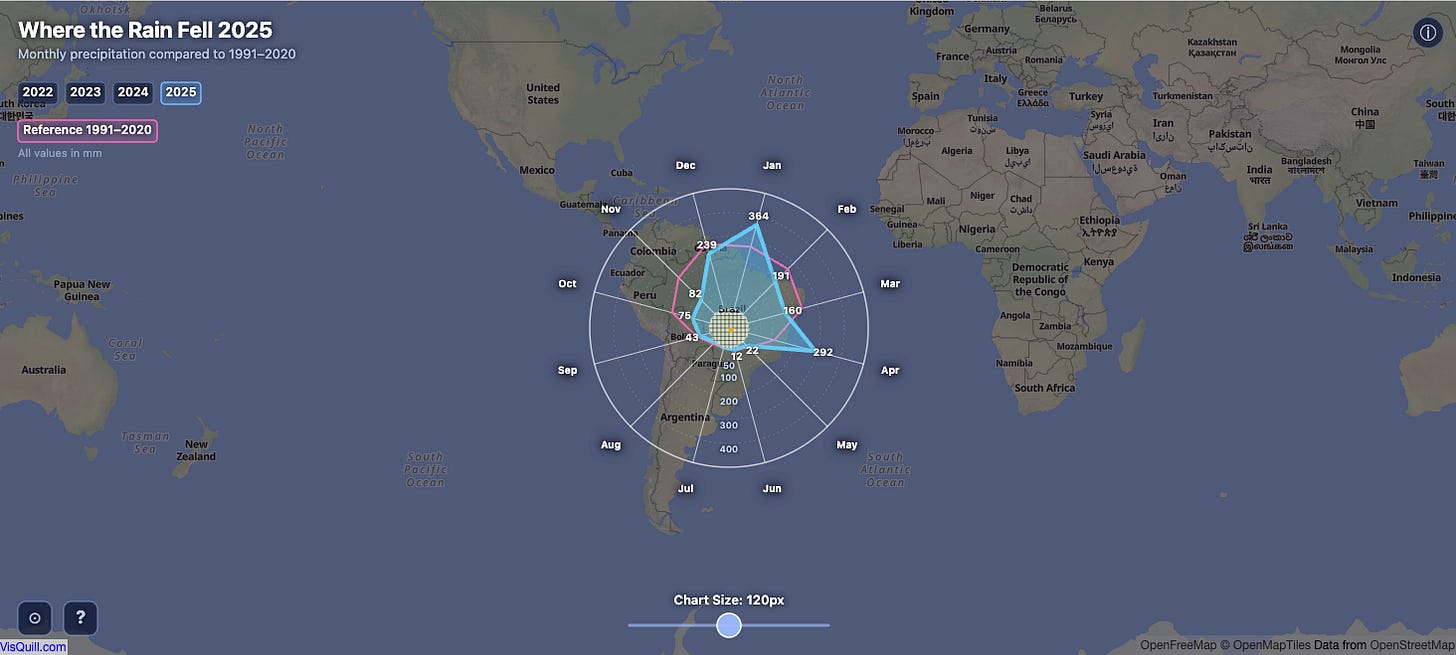
Where the Rain Fell. Fun explorer tool that combines map and radar charts.
Events
𝐓𝐡𝐞 𝐍𝐚𝐭𝐢𝐨𝐧’𝐬 𝐍𝐞𝐬𝐭 𝐄𝐠𝐠: 𝐒𝐭𝐫𝐞𝐧𝐠𝐭𝐡𝐞𝐧𝐢𝐧𝐠 𝐒𝐨𝐜𝐢𝐚𝐥 𝐒𝐞𝐜𝐮𝐫𝐢𝐭𝐲’𝐬 𝐅𝐢𝐧𝐚𝐧𝐜𝐞𝐬 𝐟𝐨𝐫 𝐭𝐡𝐞 𝐋𝐨𝐧𝐠 𝐓𝐞𝐫𝐦
Sponsored by Center on Budget and Policy Priorities in coordination with Association for Public Policy Analysis & Management and participants from AARP, Committee for a Responsible Federal Budget, Urban Institute, and others.
General Information | Registration