One of the five core guidelines in my data visualization work is what I call “Integrating the Graphics and Text.” In Better Data Visualizations, I quote Amanda Cox—recently on the podcast—who once said, “The annotation layer is the most important thing we do…otherwise it’s a case of ‘here it is, you go figure it out.’”
In the book, I outline three main strategies to better integrate text into your graphics:
Remove legends and place labels directly on your chart;
Use active, concise titles; and
Add useful annotations to guide interpretation and highlight key insights.
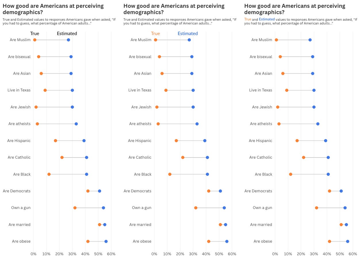
When it comes to integrating legends into your graphs, I typically show a simple dot plot and offer a few options (beyond the default of a legend floating somewhere out in space):
Place the labels above the dots;
Add color to the labels above the dots (my preferred approach); and
Color-code the labels in the title/subtitle.
It’s this last option—coloring labels in the title—that I’ve often been hesitant about.
There are real accessibility concerns when color is used as the only visual cue to link title text to chart elements. The technique introduces multiple colors into a block of text, which can easily become muddy and difficult to read, especially depending on font weight and color contrast.
With all of that being said, I found this diverging bar chart in the Washington Post last week that has made me reconsider. The chart shows the projected 10-year impact of six key components in the recent House GOP spending bill. On the one side, extending the 2017 tax cuts, increasing the standard tax deduction, and increasing the child tax credit will increase the national debt by a total of $4.3 trillion. On the other side, changes in student loan policy, rescinding climate change money, and cutting Medicaid will decrease the national debt by $1.8 trillion.
The data are grouped into two color-coded categories—“costers” and “savers” in the budget lingo. The same two colors also appear in the title—not as the sole indicator, but as a redundant encoding. The direction and length of the bars already carries the main meaning, and the colors imply reinforce it.
(Also before you ask—my testing shows that the red and green colors are consistent for readers with color vision deficiencies. But even if they hadn’t, the colors are not critical to understanding the chart.)
I think this leaves me in a new, good place for recommending when to use colors in the title for your legend: Use color in the title when it reinforces categories already made clear through other visual cues—like bar direction or grouping. When done right, this technique can add clarity without sacrificing accessibility. It also helps keep the viewer form having to jump between the chart and legend
Podcast: Drawing Data with Dragons: Cole Nussbaumer Knaflic on Teaching Kids and Adults Alike
Continuing my podcast sprint to the end of Season #11, I’m joined by Cole Nussbaumer Knaflic to talk about her latest dataviz book for kids, Daphne Draws Data. We talk about her approach to helping kids learn data and how her own practice of teaching dataviz has changed after the pandemic.
Things I’m Reading
Books, Blog Posts, and Papers
Speculating Deaf Tech: Reimagining Technologies Centering Deaf People
Trump Has Cut Science Funding to Its Lowest Level in Decades
TV, Movies, and Music
Young Sheldon, Netflix
It’s growing on me. I loved Big Bang Theory, so I appreciate seeing the original stories.
Bet, Netflix
YA show based on an anime show. Meh. But I’ll still watch it.
Your Friends & Neighbors, Apple TV
I enjoyed this one. I think it was one episode too long. Really good twist in the last episode.


Oops, hit the return button.
So I agree: the second option of your example is crisp and complete, the third misses necessary redundancy. In the Washington Post example the bars are close to the colored text in the Legend, plus the bars already having intrinsic meaning through the negative and positive signs.
Another relative argument against colored text in the legend: lighter colors don't really work well with letters, so then you additionally have to darken the tone. I also do that for colored labels inside my graphs that match to light lines or symbols, but it's extra hassle.