Hi all,
I’m sure you’ve heard it said that a graph needs to be “immediately recognizable” or “understood at the snap of your fingers” or something along the lines of “a graph is worth a thousand words.” But is it? Can you simply glance at a graph or chart and immediately understand it? I’m not so sure, so let’s do an experiment.
In many ways, what the “immediately recognizable” crowd is arguing is that when you look at a graph, you shouldn’t need to study it, read it, or look closely. Just a simple identification of patterns and trends should be enough.
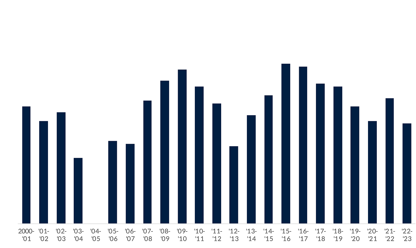
Okay, so here’s a vertical bar chart. Do you understand all of it?
Sure, you see a bunch of bars going up and going down. Maybe you saw a gap there at spot where the fifth bar should be. But is it showing different countries? States? Years? Months? You can’t tell—we need some kind of labels along the horizontal axis.
Okay, that’s better. Now I know the data start in 2000-2001 and end in 2022-2023. But I still don’t know how tall the bars are. Do they extend to 10? 100? 1,000?
Now you’re talking—that’s better. Now we can easily see that the graphs range from about 20 (ignoring the 0/missing value in 2004-2005) to around 55 or so in 2015-2016. But what are these numbers? Percentages? Dollars? Euros?
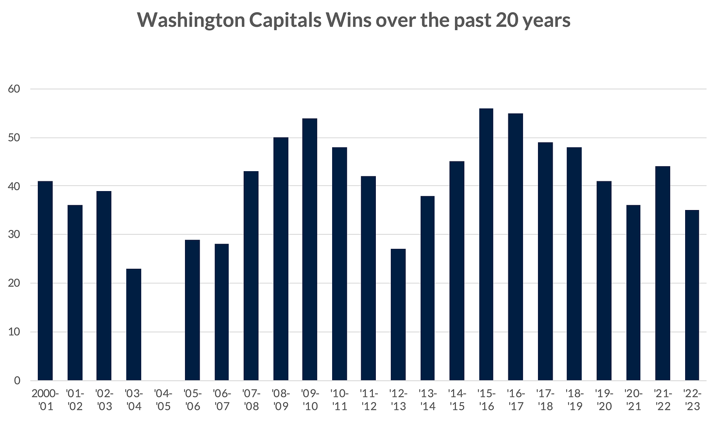
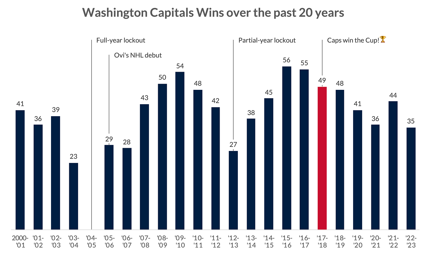
Whoa boy, now we’re getting somewhere! Number of games the Washington Capitals NHL team won in each season from the 2000-’01 season to the 2022-23 season. But we’re still not done! What’s going on in 2004-05? Why are some years higher than other years? For that, we need some additional labels and annotations.
Love it! Now we can see that there was a full-year lockout in 2004-05 and a partial-year lockout in 2012-13. And the Caps won the Stanley Cup not in the year when they won the most games (56 in 2015-16) but two years later in 2017-2018
Oh, and don’t forget, we can add a bit of highlighting to make that championship year even easier to see!
-----
So, did you understand the graph “immediately,” “at a glance,” or “right away”? Or did you need some help from some labels and annotation?
I focus a lot on text-in-dataviz in this newsletter because I think it’s one of the most important qualities to a good, effective graph. Understanding your message and what you want to tell your audience—and then how to do it—is so important to effective communication, simply relying on the bars, dots, and lines in your graphs is simply not enough.
Thanks,
Jon
PolicyViz at Home
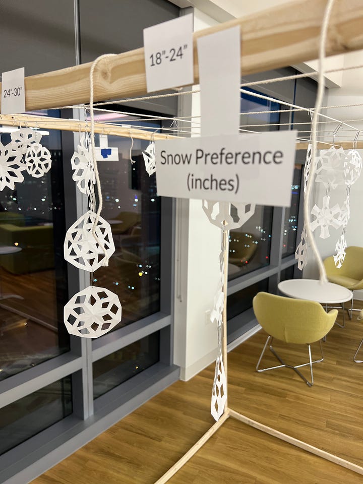
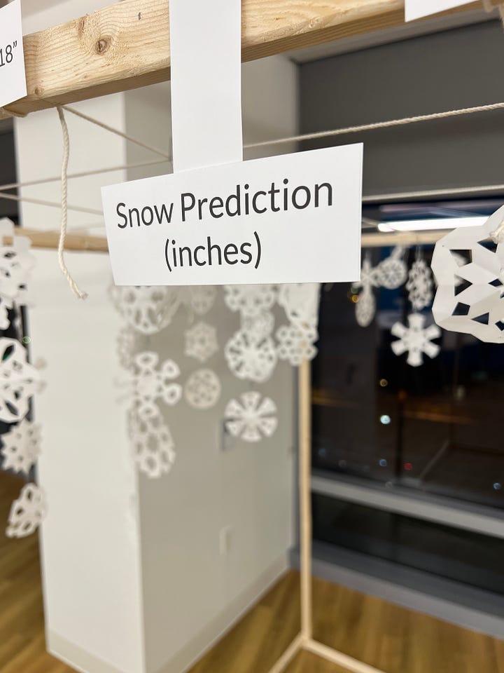
Not much to report these days, as it’s pretty quiet on the home front. I have been having fun with my data physicalization project at work. I’ve added several more projects since I originally wrote about it in November. The one that was most exciting for me—and the most difficult to build—was the 3D “Snowflake Scatterplot”, where I built a 6′ wooden cube out of furring strips (wood used to separate a surface, such as attaching drywall to stone) and connected string along the top of which to form a grid. Along one axis is number of inches of snow a person think’s the DMV [DC, Maryland, Virginia] area will receive this winter. Along the other axis is the number of inches of snow a person hope’s the DMV area will receive this winter. Estimates of both are encoded by hanging a paper snowflake in the grid. With enough guesses, participants could walk through the visualization to “experience” the snowfall.


Podcast: From Economics to Python-Powered Sports Analytics: Nate Braun’s Game-Changing Journey
On this week’s episode of the show, I talk with Nate Braun, author of several Python books, all having to do with sports. Nate shares his journey from having a background in economics to writing books on sports data analysis and visualization using Python. Despite not initially being skilled in coding, Braun was inspired by his work in environmental issues and modeling, leading him to develop fantasy football models and later educational books on coding and data analysis with a focus on various sports. We cover Nate’s data scraping and writing process, as well as the ins and outs of why he likes to work with Python and the various libraries he uses in his work.
Things I’m Reading & Watching
Books
An Indigenous Peoples' History of the United States by Roxanne Dunbar-Ortiz
The Stillwater Girls (fiction!!) by Minka Kent
Articles
Overview First, Details on Demand: Mapping Extreme Temperatures with Contours by Rob Simmon
Input Visualization: Collecting and Modifying Data with Visual Representations by Bressa et al.
The end of the line: A survey of unjustified typography by Paul Stiff
A Picture Is Worth a Thousand Dollars: Visual Aids Promote Investor Decisions by Scholl, Craig, and Chin
The Arrangement of Marks Impacts Afforded Messages: Ordering, Partitioning, Spacing, and Coloring in Bar Charts by Fygenson, Franconeri, and Bertini
Divisive Dataviz: How Political Data Journalism Divides Our Democracy by Eli Holder
TV, Movies, Music, and Miscellaneous
Super Pumped, Netflix
The Crown, Netflix
Note: As an Amazon Associate I earn from qualifying purchases.
Sponsor: Pixasquare
Pixasquare offers a variety of high-quality, low-cost design goods, from mockups to websites, logos, presentations, stock photos, and more. Head over to their website to learn more and grab great images for your next project!
Online Learning
You can take my full data visualization workshop—as well as learn how to create more than 50 graphs in Excel and PowerBI—by taking my online, asynchronous workshop over at Skillwave! I answer all questions posted to the course, which you can take at your own pace.






This is so informative. Thanks, Jon.