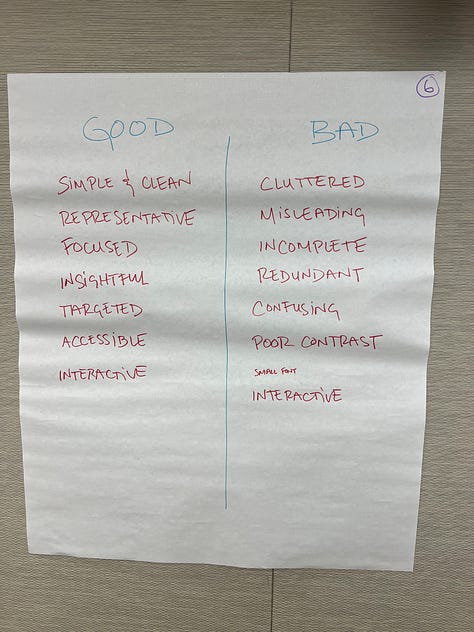
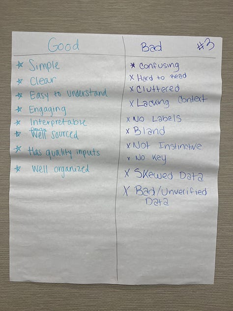
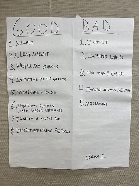
With many of my data visualization clients or classes, I like to begin with a simple exercise: draw a line down the middle of a piece of paper. On the left side, write down a list of the things you identify as characterizing a good data visualization; on the right, a list of things characterizing a bad data visualization.
Invariably, similar words and phrases show up. On the good side: “clear,” “simple,” “legible,” “good colors and fonts,” “good labels,” and “accessible.” On the bad side: “biased,” “cluttered,” “vague,” “confusing, “overly complex,” and more.


But one word always catches my eye. Simple. What does that mean? Are the data simple, like dollars or percentages? Or is the graph simple, like a line or bar chart? Is it about the framing of the graph, as in the words in and around the graph are clear?
But simple? Let’s take a closer look at that word. Webster’s includes four entries for the definition of simplicity.
In our data communication work, we are often looking to be direct (4a) and have restraint in ornamentation (4b). But I don’t know if a lack of subtlety (2a) applies to a lot of effective data visualizations. We might ask readers to extend the knowledge presented in the graph to their own experience or expertise.
I’m also not sure an effective data visualization is one that is uncomplicated (1). Take this 2015 line chart from FiveThirtyEight. There are 3,282 lines on the graph—is that uncomplicated? It’s clearly easy to see in the graph how much better Messi (thick, labeled, red line) and Ronaldo (think, labeled, dark gray line) are than the rest of the 3,280 forwards and midfielders over this five-year period. The use of the position of those two lines combined with the different colors, thicknesses, and labels makes those them easy to find in what is an otherwise dense graph.
In short, I’m not sure that simplicity is what we should be striving for in our data work. I wouldn’t call the FiveThirtyEight graph “simple,” but I would say that it is “clear.” It’s clear the author wants us to see those two lines for Messi and Ronaldo. Instead of simplicity, therefore, what if we used the term clarity? Webster’s includes five entries for the word clarity, each of which, I think, does a better job of describing what we are trying to do when creating an effective graph or chart.
We want the graph to be easily understood (a) and for the reader to have a full, detailed, and orderly mental grasp (b). Like, the restraint in orientation entry for simplicity, we want our graphs to have a lack of marks, spots, or blemishes (e). (I’m taking quality of being easily seen through (d) as not applicable to our use case).
If we can strive for clarity in our data communication efforts, our work will be more easily understood and enable our readers to have a full and orderly grasp of the graph and its content. So next time, when someone asks you what makes a good graph, answer that clarity distinguishes the most effective ones.
Podcast: Visualizing the Future: Navigating the Shifts in Data Storytelling with Enrico Bertini
You know Enrico Bertini, right? Writer, teacher, co-host of the Data Stories podcast, Enrico does it all. Now at Northeastern University, I invited Enrico to the show to talk about his research, great Substack newsletter, and for views on the evolving landscape of data visualization on social media. In our discussion, Enrico emphasized the significance of interdisciplinary collaboration at Northeastern University. He has some concerns about the current state of visualization theory and tools and talks about his ideas around “critical data thinking” as a crucial way of thinking about data visualization, highlighting the challenges of data accuracy and interpretation. We also talk about Enrico’s teaching methods to help students improve their data interpretation and data visualization skills. Enrico and I share some of the same feelings about the shifts in social media use in the dataviz community, and how it has led to a loss in diverse intellectual exchanges, underscoring the importance of finding new ways to foster community engagement and creativity, including through writing platforms like Substack and LinkedIn.
BONUS Podcast: Insights from the Tableau Conference in San Diego
A short—solo!—bonus podcast episode where I talk about the recent Tableau Customer Conference in San Diego. My review focuses just on the positives of the conference—the upcoming features in Tableau, such as allowing Tableau Public users to save work their locally, as well as some thoughts on why I—who is not a huge Tableau user—actually attends the conference. I also discuss a few of the sessions I attended, including hands-on sessions and games in Tableau.
Things I’m Reading & Watching
Books
Everyday Data Visualization: Design effective charts and dashboards, by Desireé Abbott
American Prometheus, by Bird and Sherwin
Data Conscience: Algorithmic Siege on our Humanity, by Marshall and Gebru
Articles
Access to Gender-Affirming Care and Transgender Mental HealthEvidence from Medicaid Coverage, Mann et al.
“One part politics, one part technology, one part history”: Racial representation in the Unicode 7.0 emoji set, by Kate Miltner
Du Bois Wrapped Bar Chart: Visualizing categorical data with disproportionate values, by Karduni et al.
Data Visualizations
Democrats Hold Leads in 4 Crucial Races That Could Decide Senate Control from the New York Times (showing polling errors)
Biden has installed the most non-White judges of any president from the Washington Post (beeswarm)
Who has the lowest (and highest) mortgage rates, and more! from Andrew Van Dam (lots, including a bump chart!)
TV, Movies, Music, and Miscellaneous
Shogun, Hulu
Big Bang Theory, Max
Note: As an Amazon Associate I earn from qualifying purchases.
Support the PolicyViz Newsletter
Please help support this newsletter by rating and reviewing the PolicyViz Podcast on iTunes or any of my books on Amazon. More ⭐️ ⭐️⭐️⭐️⭐️ reviews go a long way towards attracting more listeners and more readers.


Love the "simplify" vs. "clarify" distinction! I work in sports analytics and that's something I feel pretty strongly about.
The clearest example of this that I've noticed of this in my work is that there's a tendency in some sports analytics circles to move towards "all-in-one" metrics. These are numbers that aim to boil down the entirety of a player's value into a single number.
This is convenient and easy in a lot of ways (i.e. now you can directly model a player's value against their salary), but I think in practice it usually abstracts away too much information, like the specific things a player might do well and the role they're being used in. A lot of my work is around presenting that data in ways that are easier to digest but not in a way that hides the underlying information.
I appreciate any discussions around that type of nuance in data viz!