
Social Security Explained: How the System Works and What's Coming Next

Social Security is the largest single federal government programs in the United States. Polls consistently show that many Americans are big supporters of the program but at the same time, are unsure how it works, how benefits are calculated, or what will happen as the trust funds approach exhaustion. As a result, discussions about Social Security are often driven by misconceptions, fear, or overly simplistic claims that don’t reflect how the program actually operates.
In a new video series on my YouTube channel, I try to use clear data, straightforward explanations, and carefully chosen charts to walk through the fundamentals of the Social Security system. The videos cover how benefits are calculated, how payroll taxes flow into the system, why the baby boom generation plays such a central role in today’s financing challenges, and what terms like scheduled benefits, payable benefits, and trust fund exhaustion really mean.
A key focus of the series is, unsurprising, data visualization. Social Security can seem overwhelming, but there are just a handful of graphs that explain most of what’s happening beneath the surface. By breaking key graphs down step by step, I’m hoping to help viewers build an intuitive understanding of the system—how money moves in, how it moves out, and why demographic change matters so much for long-term solvency. The goal isn’t to advocate for a specific policy solution, but to give people the tools they need to think more clearly about when it comes to reforming the program.
I’m really just trying some things out. With the fragmentation of social media, fewer centralized places for the communities I work with to talk and exchange ideas, I wanted to see what power there is in creating data and dataviz-rich content.
I hope you’ll check it out—and let me know what you think!

PolicyViz Podcast with Nick Hart
I chat with Nick Hart, President and CEO of the Data Foundation, about the rapidly changing landscape of federal data, statistical agencies, and evidence-based policymaking. We explore how the Evidence Act reshaped government data infrastructure, why privacy protections and data governance matter more than ever, and what’s been happening behind the scenes over the last year as agencies faced staffing cuts, data removals, and unprecedented political pressure. We also discuss state and local data roles, the risks of politicizing data, and two public-facing initiatives from the Data Foundation: the Evidence Act Hub and the People’s Data 100. This is a wide-ranging conversation about trust, transparency, and why government data quietly underpins far more of our lives than most people realize.

Fun Graphs
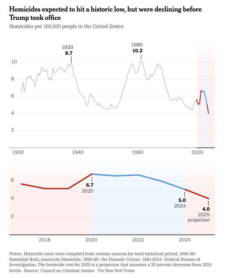
Great work from Ashley Cai at the The New York Times with these zoom-in/zoom-out graphs using something as simple as color to highlight where the zoom is happening.

Books, Articles, and Podcasts
Administrative Burdens in the Social Safety Net by Pamela Herd and Donald Moynihan
The Federal SOGI Data Landscape Under the Second Trump Administration: One Year In Review from the movement advance project (MAP)
“When the Word Is Too Big, It’s Just Too Hard”: Stroke Survivors’ Perspectives About Health Literacy and Delivery of Health Information by Wong et al.
TV, Movies, and Music
The Pitt, HBO
Obviously.
Shoresy, Hulu
The most recent season is its best. Teamwork + hockey + (not appropriate in fun of children).
The Astronaut, Hulu
Yeah, kinda fun.
Dead of Winter, HBO
This was really good. Also, why can’t more movies be 90 minutes?!?!?
