Hi all,
I’m working on a blog post about BANs. While so many tout the benefits of BANs in their work—particularly in dashboards—I haven’t found a lot of writing about how to use them well and how to use them in other platforms, such as in reports or presentation slides. Here’s just part of that post, which I hope to have ready sometime later this week.
….
The Power of Big Aggregate Numbers
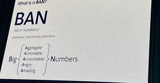
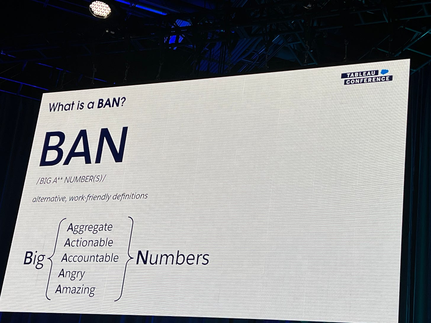
The phrase “Big Aggregate Numbers”—sometimes called “Big A** Numbers” or “Big Actionable Numbers” and abbreviated as “BANs”—carries significant weight in the data visualization community. Most of the time BANs are discussed are in the context of dashboards—adding big, takeaway numbers the top of the page to help users get the main takeaway message. But BANs can be used in many kinds of data visualizations from tweets to slides to reports and here I’ll describe the power of BANs in these other use cases and how they can be effectively leveraged in your data visualizations.
Best Practices for Utilizing BANS
Others have written about best practices around using BANs, which I’ve tried to distill into a list of five here:
Define Clear Objectives. What is the purpose of the BAN in your data visualization? The answer to that question can only really occur if you’ve identified the needs of your users. Some of your users will want to dive into the details of the data, even moving beyond summary statistical measures like means, means, variances, and correlations. Others will want the top-line or headline number that can help them get the main takeaways from the data.
Choose the Right Metrics. BANs are distinct from graphs, charts, and diagrams because they show only a single, aggregate number rather than enabling users to compare different values, be it across categories or over time. It is important to select appropriate metrics to present as BANs—the chosen numbers should be relevant, meaningful, and aligned with the objectives of the product. When using summary numbers like BANs, it is even more important to give careful consideration to presenting misleading or biased interpretations of the data.
Contextualize the Data. While BANs can provide valuable insights, it is essential to provide context to avoid misinterpretation. Supplementing the numbers with relevant labels, qualitative information, explanatory notes, icons, or other (smaller) data visualizations helps present a comprehensive and accurate understanding of the data.
Visualize the Data. BANs are often combined with graphs—for example, line charts or bar charts—to help put the BAN in context. In these cases, the graph helps can provide useful context but is typically not intended for the user to pick out other specific values. Graphs paired with BANs, therefore, should be considered as providing overarching views rather than promoting detailed drill-downs.
Prompt Drill-Down Analysis. Having said that, while BANs offer a high-level perspective, they also enable users to drill down further into the data to uncover deeper insights in, for example, interactive dashboards. In other cases, say, static reports, they can also highlight key numbers to encourage readers to explore the text and other graphs and tables in more detail.
Conclusion
BANs play a pivotal role in data visualization and can provide concise and informative representations of complex datasets. Their ability to simplify information, identify trends, highlight particular numbers, and support decision-making makes them a powerful tool. By following the best practices listed above, you can help your readers, users, and audience members and leverage the main insights from your data and analysis to make informed decisions.
….
Thanks,
Jon
PolicyViz at Home 🏡
It’s been a while since I published a newsletter. Things just got away from me. My son had a strained achilles tendon for a couple of weeks, which, though unfortunate for him because he’s in a boot for 1-2 weeks, meant we didn’t need to drive about an hour away for a weekend-long baseball tournament in Fredricksburg, VA. That meant plenty of time for me to catch up on all things home—weeding, power washing, fixing, cleaning pets’ cages, and the like. In late May, my wife and I went to see the Avett Brothers at Wolf Trap, which is one of those little gems in Northern Virginia that oftentimes gets overlooked. It is the only national park dedicated to the performance arts and is just amazing. We spent last week on vacation and I’ll write more about that trip in the next newsletter.
PolicyViz Podcast with Joe Sharpe and Mike Orwell
Joe Sharpe has been founder and creative director at Applied Works since 2005, a design studio using data visualisation, user-centred design and storytelling to create digital tools and products that drive positive change. Joe also teaches on the BA Graphic Design degree at Kingston School of Art, running an elective pathway for second and third year students that explores how emerging technology is transforming the way we communicate, work, play and consume.
Mike Orwell is a digital executive producer, filmmaker and consultant. Between 2009 & 2018, he was a producer and commissioning editor at the BBC and since then has worked with award-winning digital production studios like Unit9, Marshmallow Laser Feast and Applied Works to explore new storytelling methods. At the BBC, he pioneered various mass-audience, data-driven storytelling & branching narrative projects , including the Great British Class Calculator and the BBC Lab UK platform. His boutique film-making collective Elastic Semantic specialises in telling research-driven science & engineering stories for clients such as Arup.
PolicyViz Podcast with Jonathon Reilly
Jonathon Reilly is an innovative and results-driven executive with over 20 years of experience in product management, business development, and operations. As the Co-Founder and COO of Akkio, he has helped create an easy-to-use AI platform that empowers users to build and deploy AI solutions to data problems in minutes.
Things I’m Reading & Watching
Books
Queer Social Work by Tyler M. Arguello
Poverty, By America by Matthew Desmond
Articles
AttentionViz: A Global View of Transformer Attention, Yeh et al.
Expanding Access to Healthy Food: Innovations and Insights from 11 Community-Led Projects, Waxman et al.
Blog Posts, Twitter Threads, and Videos
The Future of College Admissions without Affirmative Action, Colin and Cook
‘A Place That’s Safe’: Housing for Trans People, by Trans People
Bad Gender Measures & How to Avoid Them by Devon Price
Data Visualizations
Who Can Use (color accessibility tool)
NHL contract grades: Capitals gamble on veteran scorer Max Pacioretty from the Atlantic
America’s doughnut capital. Can we stop at just one? by Alyssa Fowers at WaPo
Unemployment Rate, April 2023 from the BLS (with a bar chart as legend)
TV, Movies, and Miscellaneous
The Bear, Hulu
The Great, Hulu
Fury, Netflix
Note: As an Amazon Associate I earn from qualifying purchases.
My new book is now available! Data Visualization in Excel: A Guide for Beginners, Intermediates, and Wonks is a step-by-step guide to creating better, more effective, and “non-standard” graphs in Microsoft Excel. You can your copy on Amazon or, if you go to the CRC Press site, you can get 20% off the list price with the coupon code “SMA34.” If you’re interested in bulk orders, please reach out to me directly because I can get you 30%+ off for multiple books. You can also check out the new webpage I’ve published at PolicyViz, which now holds some resources and typos and corrections.
Sponsor: BlendJet
The last few episodes of the PolicyViz Podcast were brought to you by BlendJet. I’m really digging my BlendJet2 portable blender—easy to use and easy to clean. Use the promo code policyviz12 to get 12% OFF your order and free 2-day shipping!


