This week’s newsletter is late, I admit it. If you follow me on Twitter or regularly visit the PolicyViz site, you might know why: I was the subject of a credit card testing fraud attack. Hundreds of fraudulent credit card charges were coming through the site and I couldn’t stop them! Ultimately, I had to shut down the shop and then the entire site. By the end of last week, things were back to being under control, but am still testing and watching carefully. You can read the full story in this twitter thread.
But now that the attack is (hopefully!) behind me, I can concentrate on some other things. I’ve got a great podcast and blog post out this week on dataviz critique (as a newsletter subscriber, you’ve already seen the post). I’m also doing some exciting work on gender and sexuality data, with a final report coming out later this spring.
For this week’s newsletter, I have another lengthy blog post for your review. I’ve been thinking about “data visualization rules” a lot lately, and while I’ve maintained there are few rules (e.g., yes, bar charts should start at zero), there are techniques that make me wonder if the creator is trying to lie to me with their charts or graphs. Thus, in this post, I’m sharing my Top 10 Ways to Mislead with Data Visualization. You may argue with the ordering a bit—or even that some of these may be considered lies—but when I immediately go into question mode when I see these techniques used in practice. As always, you can ping me with your comments and thoughts before I publish the post to the main PolicyViz site.
This week’s podcast features Lilach Manheim Laurio, author of the forthcoming book on data visualization critique. Now, if you read the previous newsletter, you’ve already seen my long post on data visualization critique, but I’m now posting that on the main PolicyViz site along with the podcast interview. The interview is interesting in itself, so I hope you’ll check it out.
Be sure to check out the rest of the newsletter as well! Lots of good stuff after the post.
Take care and thanks,
Jon
Draft blog post: 10 Ways to Mislead with Data Visualization
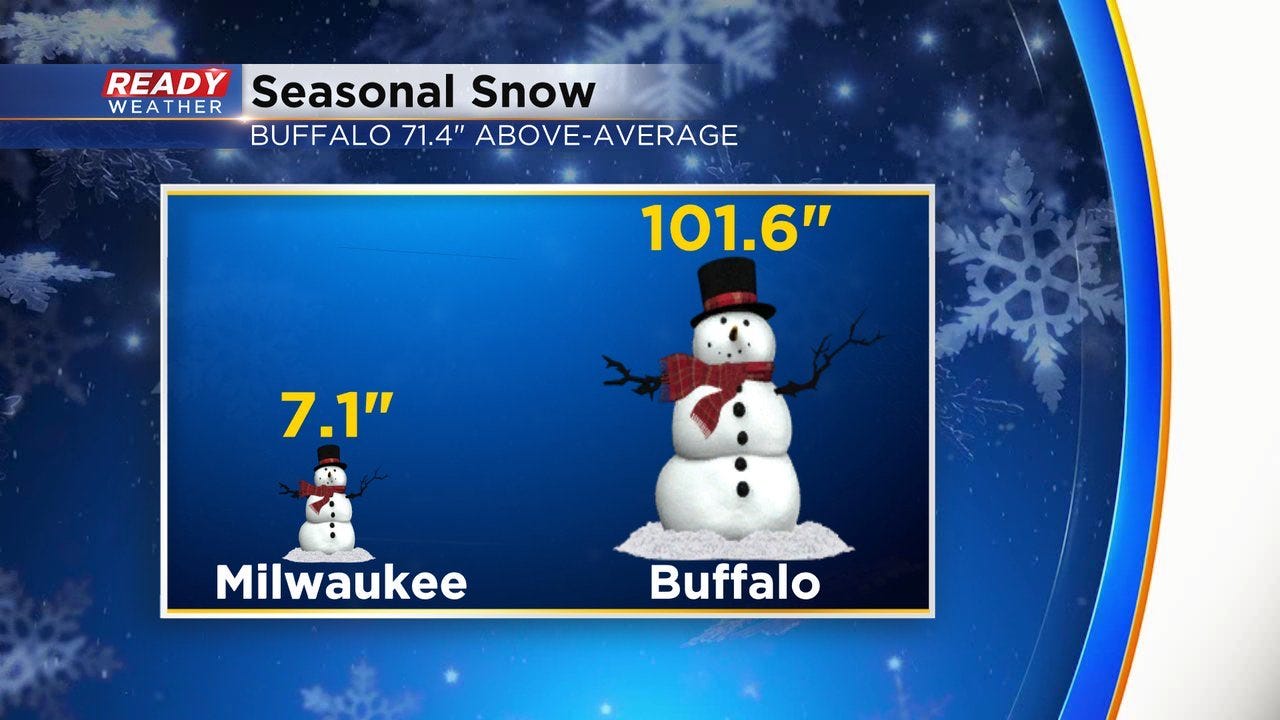
We all love the overtly wrong data visualization. The graph that is so clearly and obviously incorrect that it makes us laugh—and cry. Sometimes it doesn’t matter all that much, like this graph from a Milwaukee news channel. We all know 101.6 inches is waaay more than 7.1 inches and a much bigger difference than is pictured here, so the graph’s incorrect scale is not a huge deal. But it’s still terribly wrong.
There are cases where misleading graphs and charts can have an impact and can affect policy or decision-making. Generally, these types of graphs and charts make my ears perk up and lead me to be more suspicious—not just of the graph itself, but of the person or organization who made it. Was it a simple error? Lack of knowledge of how graphs are used or read? Or is it being done intentionally to mislead?
To illustrate how people can lie through charts, I’m listing my 10 most misleading data visualization strategies, ranked by my sense of how egregious the strategy is (remember Letterman?). These graphs and visualization strategies aren’t inherently “wrong” in the true sense of the word, but used incorrectly can mislead, misinform, and lie. And if you want a more in-depth treatment of how people can lie with graphs, I highly, highly recommend Alberto Cairo’s book, How Charts Lie.
10. Pie charts that don’t sum to 100%
Pie charts should, by definition, sum to 100%. It doesn’t matter if there is a gap because of rounding or missing data or the graph sums to more than 100%, I’m going to immediately question the accuracy of the data underlying any pie chart that doesn’t sum to 100%.
9. Charts that use 3D styling
3D charts are less common than in years past, but I still cringe a bit whenever I come across one. First off, they just look old. They look dated, like the data visualization version of clip art. But besides aesthetics, I don’t like 3D charts because I don’t know if the 3D effect is being used to make the graph “pop” or to hide something?
I promise I wasn’t trying to mislead readers with this graph from an article I published in 2007, but wow, I definitely would not do this now. Because of the 3D styling, we can’t tell what happened to the trend in the last category ($100k-$150k) prior to 1996.
8. Overlaid regression lines
Regression lines are not common across data visualization generally, but make frequent appearances in the research literature. One has to be very careful about what regression lines are showing in a graph. Is the author using the lines to suggest causality? What other variables are included in the equation to determine the regression line?
Here are two examples of misleadingly overlaid regression lines from Kevin Hassett, an economist who has worked at the American Enterprise Institute and the Council of Economic Advisors (CEA) under President Trump.
The first attempts to fit a line to a scatterplot of about 30 countries, with tax revenues as a percent of GDP on the left axis and government corporate tax rates on the horizontal axis. In what world does that line best fit the data? I couldn’t find the exact data, so I just tried to match it up to the original graphic and no matter how I slice it (my attempts in red)—with a line curve or a second-order polynomial—I don’t get close to that curve. (Brad DeLong has a great 2017 post about this graph.)
The second example is from Hassett’s tenure at the CEA where this graph—published in May 2020—shows their projections for COVID-19 deaths through the end of the year. Their “curve-fitting” cubic model exercise showed a precipitous decline in COVID-19 deaths, which was misleading at the time and, needless to say, terribly wrong in hindsight.


7. Inverted vertical axis
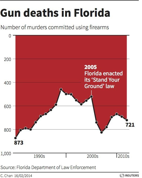
Inverted vertical axes have been used well and have been used poorly, most famously in the Iraq’s Bloody Toll (2011) and Gun Deaths in Florida (2014), respectively. In these cases, the vertical axis puts the lower number at the top (in these two, at zero), and proceeds to increase as you go down the visual. It’s definitely not standard, but it can work—as in the Iraq’s Bloody Toll graph. But it can also be deceiving, as you can see in the Gun Deaths in Florida graph. There are subtle differences here that drive the problem with the latter graph—the axis labels and axis line at the bottom of the graph; an area chart rather than a bar chart; and the dark, thick black line at the bottom of the area chart. All of these markers make us see the white area as the data instead of the red area. Yes, it can work, but be careful.
Here's another example. And another. Both seemingly intentionally trying to mislead.
6. Misleading Comparisons
Whenever a graph compares values over time, I want to know why the author chose the end points. Was it the only data available? Did the data collection process change, making a comparison between year A and year B incorrect? Or maybe they are comparing peak-to-peak or trough-to-trough, say in comparing economic conditions over time.
Climate change denier and insurrection supporter Steve Milloy published this tweet in September 2022, which claims that there has been no overall increase in global temperatures because the temperature in August 2022 is the same as it was in August 1998. Ignoring for a second that he cherry-picked a single month out of more than 520 estimates, more absurdly he drew the comparison from one high mark to another high mark. That’s like being in a recession and saying the economy is doing great because the economy is doing better than it was during the Great Depression.


5. Percentages, not levels
With data visualization, sometimes we want to show levels, other times we want to show changes, and more times we want to show shares. It all depends on the message and the data. In cases where I see percentage changes over time, my ears perk up. What is the denominator? Even in per capita numbers, is the author dividing by all people or some subset of the population? Is it a percentage change or a percentage point change?
In August 2022, Jonas Vesterberg from The Florida Standard tried to stoke the fears of transphobic parents by claiming that between 2007 and 2021, the share of kids who “received irreversible surgical procedures [to treat gender dysphoria] in the Medicaid population” increased by 1,100 percent. How many kids did that affect? Well, the number of kids who received such procedures over that time period increased from 3 to 12.
4. Maps
Obviously, I don’t mean all maps, but data-driven maps do have inherent trade-offs that can often lead to misleading data visualizations. On the one hand, maps allow people to see themselves in the data—they can find their town, their state, their country. On the other hand, map’s often correlate the size of the geography with the importance of the data value, which is not always the case. Let’s compare Russia and Nigeria for example. Russia is 6.6 million square miles, nearly 20 times as large as Nigeria. But Russia is home to 145 million people, while Nigeria is home to more than 220 million people, about 50% more populous.
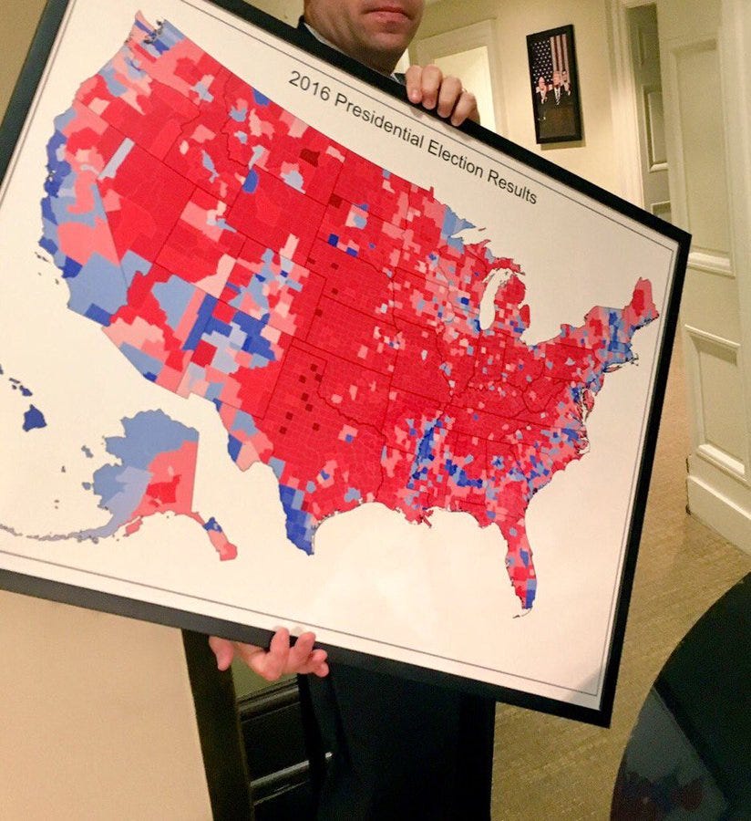
Maybe the best example of this size versus importance tension is the US presidential election map. Although the standard county-level choropleth map colors counties based on which candidate carried the most votes, it’s not the size of the county that matters, but the number of people living there. Thus, Donald Trump’s favorite map from 2016 doesn’t really show a “massive landslide victory,” but instead shows that he tended to carry larger, more rural, less populous counties. (Also, he lost the popular vote by almost 3 million votes in 2016 and 7 million votes in 2020.)
There are other aspects on data-driven maps that make my ears perk up. In particular, unusual bin (legend) sizes or categories and diverging color palettes for sequential data. Map projections don’t make me think the creator is trying to lie to me, but I don’t like the Mercator projection all the same.
3. Bar charts that don’t start at zero
The jury is still out on this one, but I think most practitioners (and maybe most researchers) would agree that bar charts should start at zero.
I’ve written about this conundrum in the past, but here is my mathematical intuition as to why bar charts should start at zero. In the graph on the left, the axis starts at zero. Imagine the increments on the vertical axis are each 1 inch. Take the ratio of the heights of the bars and you get a ratio of 1.3. The same data are shown on the right, but the axis now starts at 100. Repeat the same calculation, and you get a ratio of 2.0. By starting the axis at something other than zero, we overemphasize the difference in the two values.
2. Broken bar charts
In my opinion, broken bar charts are one of the cardinal sins of data visualization. With this technique, you add a symbol to the bar to denote that it is “broken,” but it actually extends further than the graph shows. The creator has made an arbitrary decision as to where to cut the bars and how far out to extend the horizontal axis. Every time I see it, I’m think, “Nope, this chart is definitely misleading.”
1. Dual axis charts
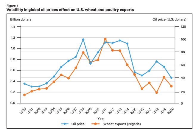
The number one graph type that makes me wonder whether the creator is trying to pull one over on me is the dual axis chart. Are the axes scaled honestly? Is the author trying to hide something by pulling my eye away from the interesting trends? Tyler Vigen at Spurious Correlations has a large collection of these charts—and I wish he’d make more—that show by simply adjusting the scale of the two vertical axes, you can make two independent series look correlated.
More generally, I think most people use the dual axis chart as a solution for getting as much data on a graph as possible. But they are often difficult to read, gridlines and tick marks don’t match up, and the focal point(s) can be misleading. There are a variety of alternatives to this kind of chart (see here and here), which offer the same data but in clearer (and less deceptive) ways.
Of course, these aren’t the only misleading data visualization practices. A smatter of others that didn’t quite make it into my top 10 include:
No source notes or links to data. Data sources should be listed and obvious.
Icons sized by area, not height or width. Be careful here because it’s just going to offend someone.
Cherry-picking the data. Not necessarily a data visualization bias on its own, which makes it harder to spot. Sometimes, especially when showing changes over time (see #X above), you can get a sense that the author is trying to hide something.
Error bars that aren’t error bars. Error bars that are supposed to show confidence intervals or ranges should do just that.
Objectively and obviously too many labels. There’s not magic rule about character count or word count on a graph, but sometimes it’s just so obvious.
Weird y-axis ranges, y-axis increments, or no y-axis at all. If the vertical axis doesn’t start at zero, I immediately wonder why. And uncommon increments along the axes—like every three or six values—also make me wonder.
I am not suggesting any of these are data visualization “rules” because 3D can be used well, icons can add visual interest, and maps can be amazingly robust. But when I see these approaches or graph types used, I pause for an extra second. To paraphrase Alberto Cairo, “We can become happier, wiser, and more hopeful by meticulously assessing good numbers and charts.”
Comments, questions, or suggestions on this post? You can email me at jon@policyviz.com, use the contact form on my website, or DM me on Twitter.
PolicyViz Podcast with Lilach Manheim Laurio
Check out this week’s episode of the PolicyViz Podcast! Lilach Manheim Laurio leads the Data Experience Center of Excellence at Visa, where she helps data practitioners across the company to elevate the quality of their data products, and improve their skills in data visualization and data experience design. Lilach’s data visualization work blends together a background in art history, library science, and human-centered information design, along with a passion for visual metaphor and pun.
Things I’m Reading and Watching
Books
Building Science Graphics by Jen Christiansen
Nightcrawling by Leila Mottley
A Revolution in Three Acts: The Radical Vaudeville of Bert Williams, Eva Tanguay, and Julian Eltinge by David Hajdu and John Carey
Articles
Next slide please: the politics of visualization during COVID-19 press briefings by Allen et al.
Give Text A Chance: Advocating for Equal Consideration for Language and Visualization by Stokes and Hearst
Striking a Balance: Reader Takeaways and Preferences when Integrating Text and Charts by Stokes et al.
Blog Posts
Wait times to receive Social Security disability benefit decisions reach new high from USA Facts
Cognitive bias cheat sheet, simplified by Buster Benson
TV, Movies, and Miscellaneous
White Lotus, season 2, HBO Max
Last of Us, HBO Max
Mandalorian, season 3, Disney+
The Menu, HBO Max
Banshees of Inisherin, HBO Max
Note: As an Amazon Associate I earn from qualifying purchases.
YouTube videos are coming back!
I promised myself that I would take some time during the holidays to record some more videos for my YouTube channel. Yeah, that didn’t quite happen, but I’ve now recorded two videos and am looking to do more in the coming weeks. Even with my recent blog post about critiques in the data visualization field, I’m keeping my dataviz critique playlist up and running. For now.


