
When a Line Chart Is the Wrong Choice
From a dataviz perspective, this line chart from Anthropic is particularly interesting. It’s from a survey Anthropic conducted in February and March of this year of 1,260 social scientists and their use of AI. In this graph, the authors show the share of researchers who report using AI generally and the share who reporting using AI coding agents, separated by career research stage.
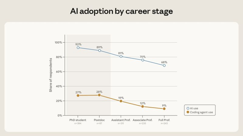
Because line charts are typically used to show change over time, this chart seems to suggest that there is drop off in AI usage as people get further into their careers; in other words, as people age (i.e., later career stages), they are less likely to use AI.
But this is a cross-sectional sample, not a longitudinal sample, so what we are actually seeing is that today's professors are less likely to use AI than today's graduate students. From everything we know about AI adoption, this isn’t surprising. For example, this slope chart from the Pew Research Center shows that 66% of 18-29-year olds use have “ever used” an AI chatbot compared with 23% of people 65 and older.
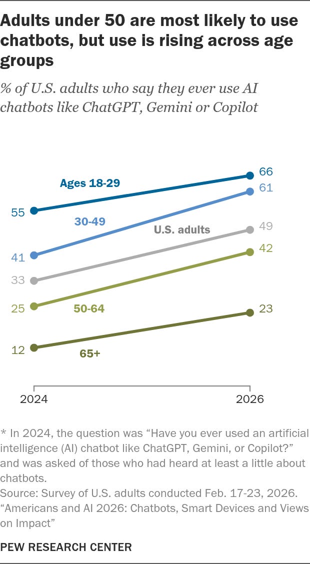
It's likely--perhaps even very likely--that today's graduate students will be more likely to use AI when they are full professors. That's the longitudinal effect that the Anthropic chart would more accurately portray (and will be interesting in a few years when another survey is conducted).
Instead, I might have used a paired bar chart or a dot plot (and there are some nice dot plots in the piece), but the line chart implies a longitudinal effect that is not there.
In addition to the overall changes in AI adoption over time, here are additional things I would like to see in these surveys:
Differences in usage of paid versions of these tools (maybe the pattern flattens out based on income). This could also be framed as people who are using AI tools when they are funded by their organization (e.g., university).
How adoption may change based on people’s trust of these tools (younger people are much more skeptical of AI tools than older adults).
The longitudinal story is going to be interesting—we’ll have to wait and see.

Season Finale of Season #12 of the PolicyViz Podcast
Season 12 of the podcast comes to a close this week, folks. Thanks to all of my guests for sharing their stories and experiences (and sending me their books!). And thanks to you all for listening! I stopped bothering to look at the traffic, but I know from talking to people and social media that the show has its niche. (Oh, and while I’m thanking people, thanks to the two new paid subscribers of this newsletter! That’s really exciting!).
Anyways, on this last episode of the season, I’m joined by David Aerne, a freelance developer and designer based in Zurich who has spent years building a remarkable collection of open-source color tools. We have a fascinating conversation about his process, his work, and all the tools you can go play with (and some of them are truly fun to play with).
I’ll be back in the fall with a whole new slate of guests!

Things I’m Reading
Making sense of PROM outcomes: a mixed method study to optimize graphical visualization formats for children by Limmen et al.
AI Regulation in U.S. States: Lessons Learned and Key Takeaways by Agrawal et al.
Participatory action research in critical data studies: Interrogating AI from a South–North approach by Medrado and Verdegem
The Folded Sky by Elizabeth Bear

I would be really interested in knowing if that was a chart Claude created with the data that was provided or if someone actually created that chart themselves in some other program. It obviously raises an issue of either implicit trust in an LLM to create the correct output, but either way it represents a misunderstanding of data visualization basics.
Yes Jon, thank you for pointing this out. Lines should never be used to connect independent categories...
Something completely different: thanks for picking up the paper by Limmen on which I was a co-author. Did you like it? It turns out it's actually pretty hard to do good research in his field, but I think we managed to find out some interesting things.
All readers: the link to the freely downloadable paper is under the section: 'things I'm reading' at the bottom.
***Making sense of PROM outcomes: a mixed method study to optimize graphical visualization formats for children by Limmen et al.***