Hi all,
I’m working on a journal paper with my friend Max Graze about creating the color section of your data visualization style guide. There are a lot of sections to possibly include in a data visualization style guide, including color, font, responsiveness, chart types, and more. In the paper we’re working on, we focus on the color section for three main reasons: First, color is so important to the data visualization toolkit. Second, at its basic form, it can be a relatively easy section to write—share the color palette(s), define color models, and you’re set. And third, at its core, developing a color palette can be quite difficult (especially non-designers like me), so we thought it would be helpful to other researchers and analysts to provide some basic guidance—including tutorials in some specific tools—on how to develop such a section.
The color palette we created for the paper is a modified version of the existing palette from Eurostat. Consistent with our past experiences, building a color palette from an existing logo or design element can make the process much faster and easier. Choosing tints and shades of different colors is often easier than coming up with the original colors themselves. We then utilized a suite of color tools (Adobe Color, Coolors, Leonardo, Viz Palette, and WebAIM) to simply the task of creating related palettes for sequential and diverging data, for example.
One of the questions we received in the review process was why did we include six colors in each of our palettes? After a bit of thinking and research, it seemed to us that there really is not concrete advice on why six colors is the “right” number of colors in a palette. Does it come from some set of rules or guidelines we haven’t seen? Does it come from the enduring set of colors in the Microsoft suite of tools? Is it rooted in the dataviz, computer science, or cognitive science literatures?
Several posts we reviewed simply assert that six colors is the right number of colors. Adobe Spectrum’s Color for data visualization says, “Categorical colors become more difficult to comprehend starting at 6 colors, and extremely difficult to understand at 12” but offers no citation or reference. There is a 2022 Career Foundry post in which the authors says, “Commonly, color palettes are made up of six colors”—so that’s really rooted in experience, not scientific evidence. In a 2019 post in The Node, Data Visualization with Flying Colors, and a 2010 article in Nature cited therein (Color coding), both argue that color palettes beyond 6-to-8 colors makes picking distinctive colors difficult. Each makes some arguments about color vision deficiency but both are pretty much rooted in experience rather than hard-and-fast rules.
Many people responded to my Tweet with references to other possible reasons for the six color palette, each of which, I think, builds to a reasonable explanation as to why six colors makes sense:
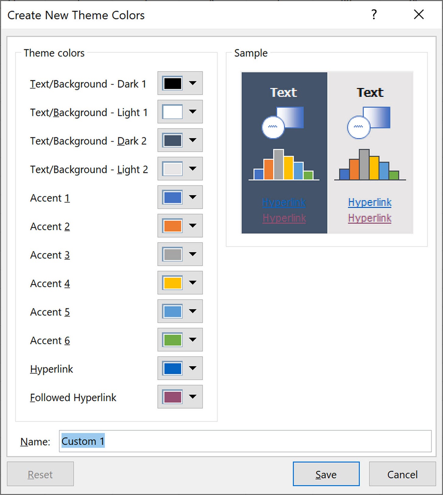
Tamara Munzner—who, in her book says that a good rule of thumb is 6-12 colors—told me that color palettes with 5-6 colors actually includes more like 8-10 colors because the text, structural (e.g., gridlines), and background colors should count as well. Indeed, if you look at the built-in color palette in Excel, there are six colors for the graphs, but also two pairs of text and background colors (as well as the hyperlink/followed link colors). And some data visualization style guides do differentiate the text color between the title and subtitle or colors of the gridlines and axes.
There are entire literatures related to how many objects humans can hold in our short-term memory. Some research suggests a minimum number of objects (e.g., Kaufman et al.; Appel and Haken; and Peterson and Berryhill) while other (older) research suggests short-term memory can hold roughly between 5 and 7 objects at any one time (e.g., Miller). Another line of research has examined the importance of how language and culture impacts our understanding and perception of color (Setlur and Stone; Kay and McDaniel). In recent research measuring perception, Tseng et al. report that scatterplots start to feel more difficult to read when there around six categories, but people are still accurate (namely assessing means) with up to about 10 categories.
I also spoke with Maureen Stone about this question, who was gracious enough to carve out an hour of her day. She began our conversation with asking simple questions that we should all ask ourselves when developing or implementing colors: What is the function of color? What is the color palette for? The rest, she argued, is simply a matter of need, convention, and types of data one is going to use. Her work on developing colors in Tableau gave rise to the “Tableau 20,” which is not 20 individual colors, but 10 paired colors. They are distinct enough to be able to differentiate, but not necessarily intended to be used together.
If we want our colors to be distinct and memorable, Maureen told me, we circle to around 5 to 7 colors. To have a color truly pop out (think: Gestalt ‘pop-out’ and see Pomerantz), the limiting number is around 9 colors, but research (lab) work typically finds in that 5 to 7 range. Importantly, Maureen also noted that in the context of thinking deeply about accessibility needs, there might be a different set of 5-7 colors. She also noted that its often most important to get the first 3 to 4 colors to be accessible because those are the colors most commonly used in a color palette.
We return to the original question: ‘Why are six colors common in color palettes for data visualization?’ The answer, it seems, that the set of 5-7 colors is a convention and has some basis in science, but it’s not a hard rule. It also appears that many data visualization tools work in this range:
Excel has 6, though if you include the two text/background color combinations, there are really 10.
Datawrapper has 11, though that consists of 5 hues—a blue (and three shades), a green (and three hues), a gray, a red, and an orange (and three hues).
Flourish has several palettes than range from 3 to 11 colors.
Google Sheets has 6, plus one text/background combination.
There are obviously considerations and guidelines around accessibility, contrast, data models, and more, but, at its core, 5-7 colors seems to be the right starting point.
PolicyViz at Home 🏡
Baseball Tournament. Last weekend didn’t quite work out as planned. My son had a baseball tournament in Delaware (about 2 hours from our house in Virginia). We drove up early Saturday morning and watched his team get destroyed in back-to-back games (he had an awesome double down the left field line though). We then had torrential rain all evening and overnight, which ended up raining out our Sunday games. So, we spent a couple of hours at a nearby botanical gardens and then drove home. Making rainbows out of rain, I guess.
PolicyViz Podcast with Tristan Guillevin
Tristan is a Data Visualization Freelancer who likes to combine different techniques to find the best way to represent data. He regularly creates tools and videos to help people build their next projects or level up their skills. Tristan is the 2017 Iron Viz Champion, and current Tableau Visionary.
In this week’s episode of the show, we talk about Tristan’s journey to freelance work and his open Tableau project that enables you to easily create bespoke data visualizations—like Sankey and Cord Diagrams—in Tableau.
Things I’m Reading and Watching
Books
Poverty, By America by Matthew Desmond
Data Mining for Business Intelligence: Concepts, Techniques, and Applications in Microsoft Office Excel with XLMiner by Schmueli et al.
Articles
Promoting Equitable Approaches in Social Sciences Research by Paul Decker and Kevin Kelly
Social Security and State Disability Determination Services Agencies:
A Partnership in Need of Attention by the Social Security Advisory Board
(Two articles for the IEEEVIS conference, which I can’t share yet!)
Blog Posts & Twitter Threads
Relationships, Joins, Blends & When to Use Them by Kirk Munroe on the Flerlage Twins website
Tableau x Figma tutorials from Kevin Wee
Data Visualizations
Journey into Sleep from Reuters
Bump chart from Voila
TV, Movies, and Miscellaneous
Succession, HBOMax
Ted Lasso, AppleTV
Note: As an Amazon Associate I earn from qualifying purchases.
Data Visualization in Excel
My latest book is locked in and off to the printers! Data Visualization in Excel: A Guide for Beginners, Intermediates, and Wonks is a true step-by-step book and guides readers through the process of creating better, more effective, and “non-standard” graphs in Microsoft Excel. You can pre-order your copy on Amazon or, if you go to the CRC Press site, you can get 20% off the list price with the coupon code “SMA34.” You can also check out the new webpage I’ve published at PolicyViz, which will eventually include some videos, more resources, and, I’m sure, an errata with typos and corrections.


