


Exploring Regional Patterns in Federal Agency Workforces

During the first month of the Trump Administration, the Department of Government Efficiency (DOGE) has cut or threatened to cut the jobs of thousands of federal workers. I’ve documented how cutting the federal civilian workforce could double local unemployment rates in some small areas, particularly those near military installations or federal correctional facilities. I’m still exploring data on federal civilian workers and in this story, I explore the geographic distribution of federal agency staff in more detail to better understand the ripple effects of reducing the federal workforce.
There are 131 federal agencies identified in the data from the Office of Personnel Management, which vary in size and location. Some agencies have very few employees and one base location, while others are very large and spread across the country. The Northern Border Regional Commission, for example, which is a federal-state partnership that provides economic development support for areas in northern Maine, New Hampshire, New York, and Vermont, employs three people in Concord, New Hampshire. The Farm Credit Administration, a financial regulatory agency that provides credit and other financial services to farmers, ranchers, and other eligible borrowers, is home to about 320 employees stretching across and 22 metro areas, from Dallas to Sacramento.
The largest federal government agency is the Department of Veterans Affairs (VA), which offers health care, benefits, and other support services to members of the US military. The VA currently employs about 490,000 people spread across the country in more than 860 metropolitan areas.
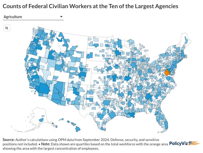
In the full post, available on the PolicyViz website, I explore the data in greater detail and present geographic data for 10 of the larger federal agencies.

❓❓❓Poll: Lemme know what’s most useful to you

Podcast: Exploring the Evolution of Data Visualization with Moritz Stefaner
In this week’s episode of the PolicyViz Podcast, I sit down with my old friend Moritz Stefaner. We discuss Stefaner's work, podcasting, his shift from bespoke data visualization projects to scalable design systems, and his collaborations with organizations like the World Health Organization.


Sponsor: Godlike.host
Godlike is a hosting service that offers game server hosting for 30+ titles, including Minecraft, ARK Survival Ascended, GTA5 FiveM, Terraria, Palworld, and more.

Things I’m Reading
Blog Posts & Papers
“Data Moves:” The Power of Transitions Between Charts from Enrico Bertini
Enrico has been killing it on Substack recently and his current post on ways to think through transitions between charts, like focusing and zooming, is really smart.
Testing Perceptual Accuracy in a U.S. General Population Survey Using Stacked Bar Charts by Rice et al.
“We build on the foundations of Cleveland and McGill’s work in graphical perception, employing a large, nationally-representative, probability-based panel of survey respondents to test perception in stacked bar charts.” I just feel like we need more work in this space to help build our basic understanding of how people use graphs and charts. I’m excited to read this one.
Historical Redlining Is Associated with Present-Day Air Pollution Disparities in U.S. Cities by Lane et al. (2022).
Maybe we’re not supposed to talk about equity any more but I wanted to better understand the intersections between climate change and segregation—plus there are some cool graphs here—that I grabbed this paper.
TV, Movies, and Music
The Pitt, HBO Max
Ummmm, this is, like, the best show on TV. Seriously. If you want a really, really, really good cry, get to episode #8. My wife and I were pretty much sobbing.
Paradise, Hulu
I still really like this show but I can’t completely tell where it’s going.
White Lotus, HBO Max
Slow slow burn here, folks. Three episodes in and there’s been only a bit of movement. I think episode #4 will start to take off though.
